
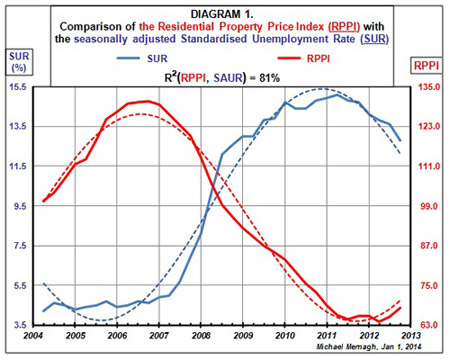
I wanted to investigate whether there is a discernible link between house prices and the rate of unemployment, and if these fluctuations move in tandem. The graph below compares quarterly values of the overall residential property price index (RPPI) with the seasonally adjusted standardised unemployment rate (SUR) over the last nine years in Ireland.
The graph indicates broadly that when unemployment was low, house prices tended to be high. Likewise, when unemployment rose, house prices tended to fall. Many economists contend that the minimum level of unemployment that can be achieved is about 4%. Unemployment in Ireland last troughed at 4.2% in the first quarter of 2005.

The mid-1990s saw the start of the ‘Celtic Tiger’ economy in Ireland. ‘Light touch regulation’ allowed financial speculators to develop a property bubble that eventually burst. The international financial disaster that erupted in 2007 brought recession to Ireland, then as 2008 began, the fallacy of a ‘soft landing’ in the property market was exposed.
A crisis followed that coincided with a series of banking scandals. The outgoing government guaranteed to cover investors’ deposits. In November 2010, Ireland negotiated bailout terms with the European Union, the European Central Bank and the International Monetary Fund. In return, Ireland agreed to cover the losses of the bondholders who had invested in the property market. The new government introduced austerity measures in 2011. At the end of 2013, Ireland exited the bailout, having met the conditions. The country has spent $85 billion in bailing out its banks. Emotions are still raw on politicians, bankers, developers, speculators and bondholders, but how can we begin to look for an end to this particular cycle of economic disaster?
Consider the negative correlation (–0.90) between quarterly values of the price of houses and unemployment in Ireland over the last nine years. Could some kind of relationship exist between those two variables similar to the Phillips Curve relationship between changes in wages and unemployment rates?
The elliptic trendline
The diagram below plots the unlagged quarterly values of the overall house prices index against the seasonally adjusted standardised unemployment rate from the first quarter of 2005 to the third quarter of 2013. The graph rose in the years 2005 and 2006. It then declined for about five years until the beginning of 2012. In the last two years, the data points have been relatively stable, but there are signs that house prices may be beginning to rise again while unemployment is beginning to fall. It seems that the data points may be cycling back on themselves.
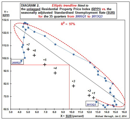

Most analysts tend to think of trendlines as always going forward (with the arrow of time), but scatterplots of other variables often bend back on themselves. Mathematical curve-fitting is indeed a scientific art form. Experimental fitting of a super ellipse to the data indicated that a simple ellipse yielded the best fit. Occam's Razor implies that the best model is the simplest model possible.
The R² = 97% of the cyclical relationship between house prices and unemployment is more rigorous than the R² = 64% of the Phillips Curve for inflation versus unemployment. The Juglar fixed investment cycle can have a periodicity running from seven to eleven years, often identified as the business cycle. My analysis of the data shows a 10½-year cyclical correlation between house prices and unemployment. Time will tell if this does in fact exist, but theoretically, such a cycle would be likely to begin again around the third quarter of 2015.
This is important as when a country is mired in the depth of a depression like the one currently affecting Ireland, it can seem like there is no end in sight. This can give way to a spiral of economic despondency. However, it is important to remember that economies run in cycles and bad unemployment and house price figures will inevitable give way to better news.


