As the popularity of coronavirus data visualizations increases, so does the risk of misinterpreting results. We’ve all heard the term flattening the curve. This catch phrase does a good job of summarizing the goal of pandemic mitigation policies: limit the number of people who are simultaneously infected to avoid straining health care systems. However common the phrase may be, it raises the question: What curve are we trying to flatten? And what do these curves tell us about how well we’re doing?
Lies, damned lies and cumulative case curves
One of the most common curves used for comparing outbreaks is the cumulative number of people who have tested positive for SARS-CoV-19, the virus that causes Covid-19 (Figure 1A). However, cumulative case counts can be misleading for a number of reasons. First, these counts don’t account for population size. Per-capita case counts seem like a good alternative, but in short time periods, where we can assume the population size doesn’t change, per-capita adjusted curves will only be stretched up or down along the y-axis and emphasize the magnitude of the curves rather than their shape. Second, the exponential nature of viral outbreaks makes it difficult to compare the scales of outbreaks between regions. Is a log10 scale better than a log2 scale? Nonlinear scales are difficult to decipher visually, especially for those who aren’t used to reading graphs.
Most references to a peak of the curve are really referring to reductions to the rates of new cases, i.e., are the number of new cases decreasing? Small fluctuations in the rate of change are difficult to see on logarithmic scales, let alone comparing multiple curves. Despite these confounding factors, a number of reports have compared how well countries are handling the outbreak based on the differences in Covid-19 case counts. Politicians are too quick to compare the total number of infections and claim victory because theirs are lower than others. This is problematic for many reasons and can lead to premature relaxation of pandemic policies.
Doubling rate
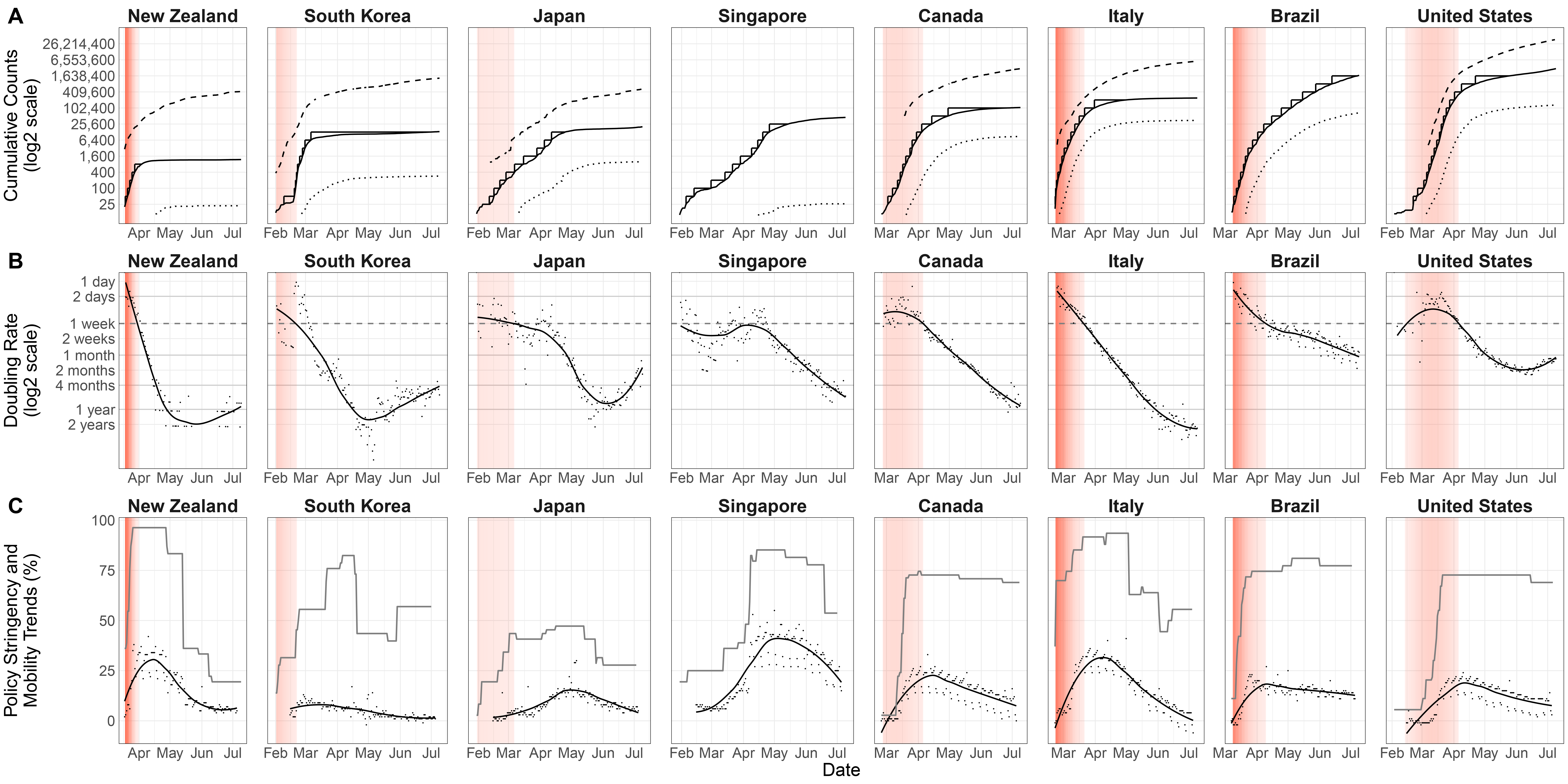
By mid-April, Italy had almost fifty times as many Covid-19 cases as Singapore. From a first glance, it looks like during this period Italy was in a far worse situation than Singapore (Figure 1A). However, Italy was beginning to see declines in daily cases whereas Singapore was in the midst of a second wave of outbreaks, with their number of confirmed cases doubling at a rate almost ten times as fast as in Italy (Figure 1B). We’ll compare the outbreaks in these two countries to illustrate how cumulative case curves can be misleading and that a more natural comparison between outbreaks lies in the pace at which the number of confirmed infections double (Figure 1B).
The doubling rate of Covid-19 cases can track how fast an outbreak is currently spreading, which can be useful in determining when certain policies might be needed to prevent uncontrolled spread. Looking back at existing data, it can identify critical periods where the rate of spread decreases or increases rapidly. To see how well the doubling rate aligns itself with other measures of coronavirus responses, we compare it to two metrics that report policy changes and public response to the pandemic (Figure 1C).
The first metric we will consider is a coronavirus government response tracker, put together in an effort to standardize a score for the stringency of government policies addressing the pandemic through 17 different indicators such as school closures, movement restrictions and contact tracing (Hale and Kira, 2020). However, policies are only effective with public support. This brings us to the second metric: Google’s mobility reports, which provide trends of public movement over the course of the pandemic. These reports are analogous to how Google reports the popular times of a business, except here they report the trends of people staying home. Together, the policy index and mobility trend provide insight into social behaviors that influence the transmission of Covid-19.

Figure 1: In this panel plot we compare Covid-19 statistics from eight countries. We highlight in red the uncontrolled spread of the virus as defined by doubling rates of less than 1 week. The red gradient starts at a one week doubling rate (light red) and gets darker as the doubling rate speeds up (i.e. a one day doubling rate is colored in dark red). (A) The dashed, solid and dotted lines are the cumulative number of tests, positive tests and reported deaths, respectively. The y-axis is on a log2 scale indicating “doublings” of counts. We highlight with steps the time it takes to reach another doubling of case counts. Note: the cumulative number of tests for Singapore and Brazil was not readily available. (B) As the curve flattens, the spread of the virus slows down, leading to an increase in doubling rate. (C) The grey line is the stringency index provided by the Coronavirus Government Response Tracker from Oxford University. The black dots and smooth line are Google’s Mobility Reports on the percent change in residential mobility. The alignment of each of these metrics with the growth rate of cases shows that government policy can change social behaviors that in turn impact the rate of cases being reported.
To explain how Figure 1 all fits together, let’s consider the case of Singapore. The solid line in Figure 1A is the cumulative number of positive Covid-19 tests, shown on a log2 scale, and there are two periods (shaded in red) where new positive cases seem to accumulate faster than in other periods. If we move down to Figure 1B, we see that that these two shaded periods correspond to times when the number of confirmed new infections was doubling in less than a week. Coinciding with the second of these two periods, in mid-April, we see from the grey line in Figure 1C that the Singaporean government implemented a new round of strict pandemic mitigation policies, leading to a continuing increase in the percentage of people staying home (as measured by Google’s Mobility Reports). After weeks of adhering to these new guidelines, the rate of new cases starts to drop off, as can be seen from the flattening curve in Figure 1A and the downward direction of the curve in Figure 1B.
While each metric in Figure 1 on its own may be useful to some extent, the combination of multiple coronavirus metrics allows us to see the bigger picture and build a narrative that explores how the stringency, timing and public acceptance of pandemic mitigation policies can have a real impact in flattening the curve.
These types of panel plots can be useful for retrospective work determining what policies became effective when. Of course, it’s much easier to build a narrative with 20/20 hindsight, but we can still try to identify why some outbreaks have been controlled better than others in hopes of improving our current and future responses.
South Korea was one of the first countries impacted by the Covid-19 pandemic and had cases doubling every few days in early February. However, the outbreak was soon under control and, by the end of February, their cumulative case curve was flattening rapidly. Much of their success in containing the Covid-19 pandemic can be attributed to having pandemic response frameworks in place after having experienced respiratory-virus outbreaks in recent years. Figure 1 provides some additional insight in how they managed to flatten their curve so drastically. While they already had some policies implemented by early February, the rate of new cases only slowed down when a second round of more stringent policies were put in place (as shown by the third spike in the stringency index around mid-March). This suggests that some policies may only be effective when part of a more comprehensive response, and that the outbreak can be only be contained once a threshold of limited transmission is met.
While some countries have managed to flatten their curves quite rapidly, others have struggled to limit the spread of the virus for a longer period of time. To illustrate this difference, we highlight in red the time each country spent with “uncontrolled growth” (Figures 1 and 2). The red gradient starts at a one week doubling rate (light red) and gets darker as the doubling rate speeds up (i.e. a one day doubling rate is colored in dark red). While all the countries included in this panel plot no longer have cases doubling every week, there are some concerning trends emerging as societies re-open. For example, the United States’ doubling rate is currently at 1 month and trending upwards. With over 2.5 million confirmed cases as of July 1, the US is on track to reach 5 million cases by the beginning of August 2020.
The longer the virus spreads freely, the more likely it is to reach new places causing a new outbreak. Eventually, this can lead to a checkerboard of hot spots, each spreading at their own pace, where some outbreaks may be tapering off and others growing exponentially. This means that by summarizing over an entire country, we may lose some resolution regarding the speed at which each individual outbreak is spreading.

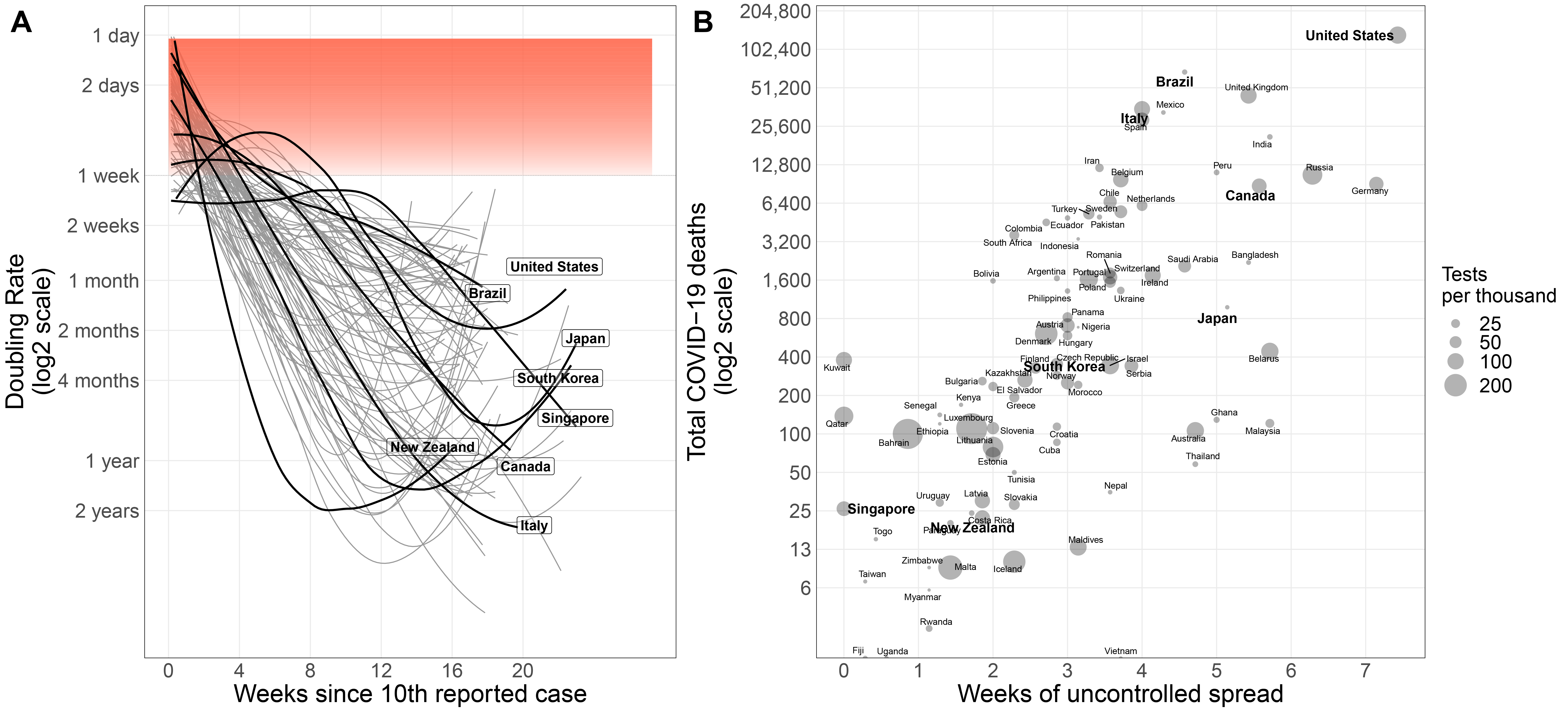
Figure 2: Flattening the curve rapidly saves lives. (A) The doubling rate of confirmed cases by country. We highlight in bold the countries we visualize in Figure 1. The red gradient indicates rapid growth rates resulting from uncontrolled spread. To compare the response times between countries, we define “uncontrolled growth” to be when the doubling rate is less than one week. We then measure how long it takes for a country to slow down their growth rate to beyond our one week speed limit. (B) Countries that reduce transmission rates quickly have fewer Covid-19-related deaths. The x-axis reports the time each country has spent with a doubling rate of less than one week. The y-axis is the total confirmed deaths related to Covid-19. The size of each point reports the total tests per thousand.
How long did it take to flatten the curve?
For the purposes of comparing response times between countries, we define “uncontrolled growth” to be when the doubling rate is less than one week. We then measured how long it takes for a country to slow down their growth rate to beyond our one week speed limit. We find that the time it takes to slow down the doubling rate correlates with higher mortality (Figure 2), where more people die from the virus in countries that take more time to get the virus under control. One possible explanation is that exponential increases in healthcare needs exceed finite healthcare capacities. Some hospitals can handle surges, but no hospital can handle uncontrolled exponential growth.
There appears to be a critical period where the difference in government response timing dictates how long the virus can spread freely. For example, New Zealand and South Korea already had pandemic mitigation policies in place by the time the first 10 cases were reported (Figure 1C). Both of these countries were able to reach our seven-day speed limit within two weeks and now report some of the lowest numbers of Covid-19 fatalities (Figure 2B). On the other hand, Canada and the United States were much slower to implement social distancing policies, with some provinces and states waiting several weeks after the 10th reported case. It took over twice as long for Canada and the United States to reach the same speed limit and they now report many more fatalities. The old proverb “an ounce of prevention is worth a pound of cure” seems appropriate here.
The early days of the outbreak are critical in mitigating the mortality caused by the pandemic. Left uncontrolled, the virus will continue to spread to exponentially more people. During such a phase, the cases will continue to double in a matter of days. The thing about exponential growth is that it keeps growing faster as time goes on. This is why rapid implementation of pandemic mitigation policies lead to a sharp decline in the rate of new cases, whereas slow responses lead to more gradual declines.
Recommendations
As many governments develop policies in data driven manners, data visualizations need to be drawn with care to avoid misinterpretation. After all, decisions made by politicians are dependent on their understanding of the information presented to them. It is especially critical during a pandemic to convey as much information as possible yet remain intuitive and meaningful. One thing to keep in mind is that policies on their own won’t stop the virus without public acceptance. People are more likely to adhere to pandemic mitigation policies if they understand how their actions are impacting the spread of this virus. Good data visualization can disseminate accurate and up to date information widely.
All of these circumstances are dependent on the accuracy of the data being reported. Precautions must be taken in analyzing the available data as a number of confounding factors can influence their interpretation. For example, one way to artificially reduce the number of cases being reported is to reduce the number of tests performed. In general, including data from multiple angles (e.g. number of tests, doubling rate, reported deaths) can mitigate some of the issues mentioned above. We encourage governments to be as transparent as possible with coronavirus testing results and patient outcomes. These data are fundamental to our ability to grapple with this pandemic. Especially as some regions are gradually lifting pandemic policies, data visualizations can accurately monitor the outbreak and encourage public involvement in overcoming this pandemic.
Notes
All the data used in this analysis is publicly available, and the detailed methods and scripts used to analyze and graph the data are available on Github.
Main article illustration by Bosny (bosnyart.com).
About the authors
Luke Anderson-Trocmé is a PhD candidate in statistical population genetics at McGill University.
Sahir Bhatnagar is an assistant professor in the Department of Epidemiology, Biostatistics and Occupational Health, and the Department of Diagnostic Radiology at McGill University.


