If I recall correctly, at various points in the match he had more unforced errors and a lower first serve percentage. In tennis – and in life – this is bad. While I’m sure this was balanced out by more winners and break points, it wasn’t immediately clear to me which of the stats I should be focusing on, both as a fan and data nerd.
For example, was it important that his first serve percentage was lower than his opponent’s? According to some, first serve percentage is a huge determinant of success. I biked home that evening with an empty, unsatisfied feeling inside.
Luckily, however, and without it being socially inappropriate, I’m able to scratch my itch and get to the bottom of this. To the numbers!
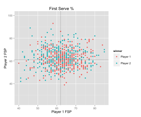
First, let’s see if first serve percentage is really all it’s cracked up to be. For our purposes, the mark of an important tennis stat is one which is able to distinguish players who won the match from players who lost.

First serve percentage, it appears, does not do a good job at telling us who’ll win and lose.
What about unforced errors and winners? Would having a lot of winners and few unforced errors do better at separating the outcome of a match?

In this case, I looked at the difference between Player 1’s stats and Player 2’s. For example, the bottom right quadrant is the area where Player 1 had more winners and less unforced errors than Player 2. Clearly Player 1 is more likely to win when this happens, evidenced by the number of red dots.
You can see that simply having more winners or fewer unforced errors alone (upper right and lower left quadrant) doesn’t do a great job of separating our game’s winners from losers. You need both working in your favor in order to win.
That leaves us with the final question: What is the most important stat?
Perhaps unsurprisingly to the tennis fan, break points is the most crucial of the stats that you would typically see. Just how important?
Technically speaking: very.
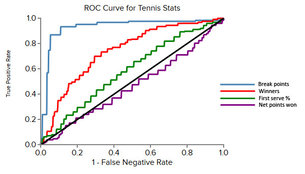
We can visualize the difference with a receiver operating characteristic curve. This is a way to measure how much a variable discriminates between two classes – winners and losers in our case. The higher up and to the left the curve bends, the better. Anything close to the 45 degree line is practically guessing.

Looking at the curves above, you can see that the break points line is the furthest to the upper left, indicating that it’s the best separator of winners and losers.
Viewed more concretely, here are the confusion matrices associated with each variable, helping us see how many players each model guessed correctly and incorrectly (blue is good, red isn’t).

To summarize:
- Break points are useful
- Winners combined with unforced errors are also useful
- First serve percentage is slightly worse than useless
Hopefully this helps you in deciphering the next tournament’s stats!
This article first appeared on Ilan’s Dataman blog.


