![]()
“Best fit” line is one of the misleading terms that confuse occasional users of statistics. It usually implies a line fitted by linear regression that minimises a function of the distances from the line to each data point (measured parallel to one axis, and squared to make the sum positive). But does this mean it is the best approximation or interpretation of the data?
A handout I use when teaching graph design is a sheet with several copies of a scatterplot of points. The question is, how many different lines can you draw on such a plot? With no context for the “data”, you can weave many different stories with lines that link or approach the data points.
Figure 1 is a simple scatterplot, and perhaps you would like to make several copies and try that exercise before reading on. It is based on made-up numbers with no particular meaning but is not untypical of the small data sets that appear in so many publications, generally with a “best fit” line added.

FIGURE 1 Example scatterplot without context – how many summary lines can you suggest?
The previous article in this series noted the distinction between graphs used as tools during data analysis and graphs used in presenting results. Here I want to distinguish between lines added as visual guides to a perceived pattern and lines that derive from a supposed data-generating model.
Figure 2 shows numbers of hobbies breeding each year between 1992 and 2001 in a Derbyshire study area.1 Hobbies are small falcons (Falco subbuteo) and summer visitors, so birds need to survive the winter in Africa and return each spring to claim a territory. The number of nests is of course integer, and the simple regression line indicates a trend. The paper in the journal British Birds, from which the data are taken, states simply that “The population increased during the study period”, and discusses this in relation to climate change and species’ range expansion in the UK over recent decades.
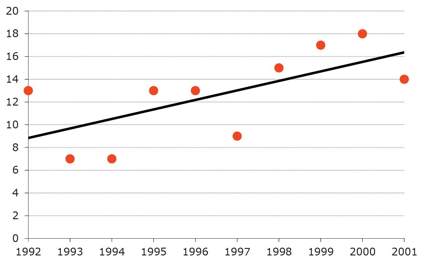
FIGURE 2 Derbyshire breeding hobbies. Data and model as drawn using Excel and presented in British Birds:1 linear regression with normal errors.
I have no issues with the paper, but is linear regression the best choice? The slope is significant, but the assumption of normal errors for small counts might be a technical objection. Looking pragmatically at the data and considering the problems in the fieldwork (hobbies can be secretive, and a breeding pair that failed early would easily be missed), it seems unlikely that changes of one or two pairs would be important. On the other hand, roughly twice as many pairs bred during the last four years of the study compared to earlier years.
These articles set out to discuss graphs and not statistical methods, so details of the modelling process that can be found in many textbooks are omitted. Obviously this is post hoc modelling, which at this stage is descriptive. Having a count (of nests) as the response variable suggests Poisson rather than normal errors, hence a generalised linear model rather than simple regression. With just 10 years’ data I will ignore serial correlation and time series models. I used the glm command in Stata to compare the null model, simple linear, and step-change models with the break-point at each year in turn, then chose the model with the lowest value for Akaike’s information criterion (AIC).
The best fit (lowest AIC) was the two-means model shown in Figure 3. Purely subjectively, it seems to me a better interpretation of the data than the simple trend and raises the question of what might have happened between 1997 and 1998 to create or allow a step change. (The British Birds paper makes clear there was no change in field methods.)
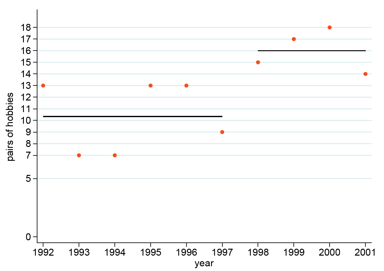
FIGURE 3 Alternative model for Derbyshire hobbies: constant means in two periods, with Poisson errors.
Suggesting two periods, within each of which the population was stable, has the advantage of not implying what happened before 1992. Between 1968 and 1972 there was perhaps one breeding attempt by hobbies in Derbyshire2 but by 1988-91 a “sevenfold increase in the midlands” was noted.3 We cannot say from the data to hand if this was gradual or in one step.
Ten data points is a small sample for choosing between models. A much longer data set comprises first arrival dates of summer-visiting birds in Shropshire, UK (the Shropshire Migrant Arrivals database). Again, a range of models were compared and, remarkably, for many species a linear trend over more than a century was the best descriptive line. There is, however, no underlying logic to demand a parametric model. Taking swallows (Hirundo rusticolus) as an example, Figure 4 shows the individual data and three alternatives for lines on a graph.
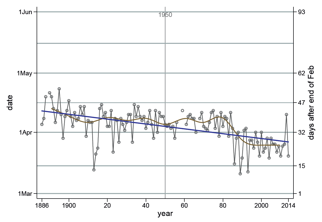
FIGURE 4 Summary of first arrival dates of swallows in Shropshire.
Joining successive points makes it easier to follow the series by eye, and makes the year-to-year variation more obvious. It also makes visible the years with no observation (missing values) as breaks in the line (I will consider in another article how this is achieved with software).
The slope of the linear regression expresses the average change per year. This may be related to climate change, but that is hardly a smooth simple trend. Hence the non-parametric (decadal) smoothing line was added to help show periods when the observations ran faster or slower than the long-term trend. Incidentally, the range of dates for the y-axis was selected so that all spring-arriving species could be displayed on the same range.
Isaac Newton famously claimed “I feign no hypotheses”, and others claim to be disinterested and “let the data speak for themselves”. Other scientists have clear hypotheses that drive the selection of which data to collect. Either approach is valid, and it is fair to clarify which drove the analysis of data. Graphs are sometimes presented with just the line for the fitted model, but this withholds from the reader any impression of how much data contributed to the fit. My suggestion is as a rule to plot both the data points and the model line but use colour, tone, size, line width and pattern, layering or other techniques to indicate which has dominance. Does the line summarise a pattern inferred from the data, or are the data shown primarily to demonstrate they conform to a scientific model?
Acknowledgements
Thanks to the editor of British Birds for providing Figure 2, and to John Tucker, who compiled the data for the Shropshire Migrant Arrivals database. Figures 1, 3 and 4 were drawn using Stata 12 for Windows.
About the author
Allan Reese is an independent statistical consultant and member of the Significance editorial board.
References
- Messenger, A. and Roome, M. (2007) The breeding population of the Hobby in Derbyshire. British Birds, 100, 594–608. ^
- Sharrock, J. T. R. (1976) The Atlas of Breeding Birds in Britain and Ireland. Berkhamsted: T. & A. D. Poyser. ^
- Gibbons, D. W., Reid, J. B. and Chapman, R.A. (1993) The New Atlas of Breeding Birds in Britain and Ireland, 1988-1991. London: T. & A.D. Poyser. ^


