I usually enjoy Allan Reese’s columns on aspects of data graphics, but I was significantly less than thrilled with the December 2017 presentation (“Key decisions”, page 42). The essential idea was that information about levels of factors or groups in plots is better conveyed visually by directly labelling the lines, curves, or bars in a plot than by using legends. I agree entirely with this assessment – it is almost always easier to see and understand the levels of factors when the labels are integrated in the plot, rather than conveyed in a separate legend.
My distress in reading this article comes mainly from Reese’s use of a secondary or tertiary source and not understanding or relating the substantive context of his examples. The original data used here for his Figures 1 and 2 came from Box and Cox’s classic paper, “An Analysis of Transformations”,1 and was made available in the Handbook of Small Data Sets by Hand et al.2 Understanding this context could have made for a far more instructive article that tells an informed story about some real data using graphs.
The data used here is a compelling example of why transformation of a response variable (originally survival time in 10 hour units) that showed a substantial interaction could be made more comprehensible, and reduce the apparent interaction by use of the reciprocal transformation: survival rate = -1/survival time; the “-“ sign reflects the fact that, for a negative power transformation, we often want to keep the order of the response variable unchanged. The plain reciprocal transformation, death rate = 1/survival time, is also interpretable in this case.
The original Box and Cox data consisted of four replicates for each combination of poison and antidote. A plot of the original data, showing means ±1 standard error bars is shown in Figure 1. It is clear that there is an apparent strong interaction between poison and antidote. But it is equally clear that the variance of the survival time response increases with the mean. The Box-Cox method is to make a power of the response, y, another parameter, λ, in a linear model, yλ = X β + ε. This and other methods (spread vs. level plots) suggest the reciprocal transformation, λ≈ -1.
Doing that transformation gives the revised graph shown here in my Figure 2, similar to Reese’s Figure 2. It is clearly seen that within-group variances are now more nearly equal, and the lines for different antidotes are now more closely parallel, suggesting that the interaction of poison and antidote has been reduced.
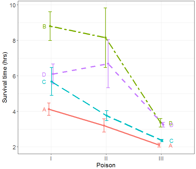
FIGURE 1 Plot of the original data data from Box and Cox showing mean survival time and ±1 standard error bars. The plot shows an apparent interaction and a clear need to transform the response or use a different model.
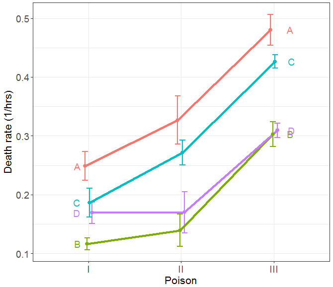
FIGURE 2 Plot of means and ±1 standard error bars for the transformed response, 1/survival time. The apparent interaction is reduced, and the within-group variances are now more nearly equal.
In producing these plots, I felt that an important part of the story told in the graph is that of heterogeneity or homogeneity of variance. Displaying variance is often hard to do in ANOVA designs using line graphs of means with standard error bars because, with a discrete factor on the X axis, the error bars often overlap, and so are not easily distinguished. The graphical solution to this problem, implemented in the ggplot2 package for R, is called “dodging” – adjust the horizontal positions for the factor enough so that the bars can be seen distinctly.
I also have a sense of unease with the second example (Reese’s Figure 3) dealing with the proportion of moth traps in each habitat annually. It is a great example of an ill-designed graph for its communication purpose, because stacking the bars for the various habitats does not allow their trends over time to be easily compared.
Yet Reese only focuses on the facts that the default ordering of categories in Excel is alphabetical and that the shading tones have little to do with the substantive distinctions among the various habitats. I agree entirely with this assessment, but the discussion of this misses the proper mark.
Criticising defaults in Excel is like shooting fish in a barrel. A general rule for statistical practice should be, “Friends don’t let friends use Excel for data visualisation or statistics”, and using such awful examples just dumbs down the discussion.
Michael Friendly
Toronto, Canada
Allan Reese writes: I can agree with almost all comments in this Friendly fire, except the suggestion I should have written the column differently. The point of the series is to draw attention, in bite-sized portions, to features in the use or presentation of graphs. As clearly stated, I took the example as used by Easterling in his book, Fundamentals of Statistical Experimental Design and Analysis. Easterling, in turn, gives the references and notes that the “article by Box and Cox in 1964 is a very influential, oft-cited paper on transformations”. Repeating the argument about variance stabilization in the column would over-feed most readers, and Easterling did not show error bars.
The second key example was chosen because it “received much media attention when published” and I believe I was the only person to draw the authors’ attention to its deficiencies at the time. The overall point was that the layout of the graph had been determined by the software, with no apparent authorial intervention. This failing can apply to any software (yes, R as well), and the central message of this series of columns is to edit and refine graphs as one does text. It is not the software defaults that are remiss, since software has to draw something, but the users who fail to recognise and countermand the defaults.
References
- Box, G. E. P. and Cox, D. R. An Analysis of Transformations (with discussion) (1964) Journal of the Royal Statistical Society, Series B, 26, 211-252. ^
- Hand, D., Daly, F., Lunn, A. D., McConway, K. J. and Ostrowski, E (1994) A Handbook of Small Data Sets. Chapman & Hall. ^


