
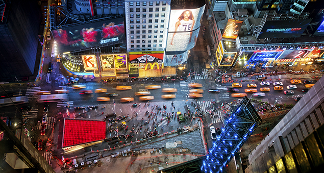
I'm standing on a street corner in Brooklyn, surrounded by graffitied brick buildings and yards, frowning at my New York subway map, already battered and torn from all the times I’ve unfolded it the wrong way. As well as the spaghetti of coloured transit lines, it includes just a few key road names.
There is a local street map in the subway station, which I thought I’d memorised well enough to get me where I’m going, a couple of blocks away. But now I can see the real streetscape, an apparently deserted jumble of industrial units and parking lots, the map I had in my head doesn’t make sense any more.
Forced to admit defeat, I go back down the subway stairs and translate the wall map into a mental list of directions. I keep rehearsing the turning points as I walk between fashionably shabby lofts, hip new eateries and apparently empty warehouses.
One of which houses my destination, CartoDB, where they use big data to make maps.
I’m visiting Stuart Lynn, a map scientist, which, as he says, “is a pretty good job title. It’s better than geographer, which I feel quite good about, because after leaving astronomy I wanted to still think of myself as a scientist.”
He’s a cheeky, self-deprecating Scot, though his accent’s veering towards Canada, possibly the effect of a few years working in Chicago on a project called Zooniverse. That enlists citizen scientists to help analyse the flood of data pouring into research projects, from astronomy to zoology.
Stuart is surprisingly sympathetic to my story about not being able to find my way to a mapping company. He says he finds navigating around New York confusing after Chicago. And it’s data he loves, not maps. But Stuart is genuinely excited about all the things you can do when you matchmake between the two.
Join up two public databases and predict whether a house has a working smoke alarm, for example. Or produce a “heat map” of public response to Presidential candidates, using Twitter mentions to colour-code the areas with the strongest response to Trump or Sanders. Stuart compares that to taking spot temperature measurements outside, and using them to model a continuous field of temperature, “so you can think about tweets as being a sentiment field for a politician”.

Stuart’s job is mostly about working with small organisations or individuals, including journalists. CartoDB aims to give them tools to quickly and easily turn data into maps.
“We embraced this idea of a citizen cartographer. Someone who is collecting data themselves, or using data that is open from the government, to make maps that are going to impact their communities, their countries and their peers,” he says.
“Trying to move beyond that, the next phase of what we’re doing is to democratise location intelligence. How can you use our tools to get a new sense of the world? Not just visualising, but being able to call on statistics and some basic techniques to really extract information.”
Stuart shows me a map on his laptop screen. At least, it looks like a map, with blocks separated by dark bands that are probably roads, but it’s only made up of coloured dots.
“This is a map that has no base map at all,” he says, “this is just data. This is Chicago, this is the river,” he indicates a broader black line, “and every point you see here is a crime.” And the crimes are colour-coded, I can see now. He goes on, dissecting the anatomy of the city that was his home until a few weeks ago. “Very, very quickly you see this huge discrepancy between these two areas. This is downtown where all these crimes were credit card fraud, financial identity theft … and then not too far away is this area.” Mainly crack, heroin and cocaine, says the map. “A much, much poorer area, and for anyone who knows Chicago this will jump out, they will know exactly where that is.”
Being able to zoom out like this, and see the patterns underlying each individual crime, is very useful if you want to do something about reducing crime in your city. But it makes me uneasy. If you live in Chicago, your address or neighbourhood now tells me something about how much crime happens around you, and what kind. It would be like my address ending “Peckham, drugs and bicycle theft, London, England”.
If you’re the Chicago Police Department, or London’s Metropolitan Police Service, you probably already know where crimes tend to happen, even without a predictive computer model. But any model would be based on the past data. You can only predict the future if the future behaves like the past. Sophisticated models can respond to change, and update themselves, but by definition one can only gather data from the present and past, not the future.
Might using data to make public maps of where crime happens, and what kind, become a kind of prophecy for the people who live there? A self-fulfilling prophecy, even?
“Yes,” says Stuart Lynn, “I think that’s hugely important. I think that’s a common problem with a lot of social advocacy. Once you name a problem it becomes self‑stigmatising.”
Part of the point of his work at CartoDB is to put that map-making power into the hands of communities, to tell their own stories, to use data for their own purposes. He recalls a programme in Chicago called “Data Science for Social Good, and there was an interesting project trying to make a predictive model of whether kids in high school were going to graduate. Or if they were going to graduate late, because graduating late is almost as bad as not graduating at all, it can have a huge knock-on effect on people’s future careers and life,” Lynn says.
“And so they were trying to predict, given the data that they had for those kids each year, whether or not there was a high probability of them baling out of school and whether or not there should be an intervention to help them. Which is amazing, great, but they were doing it at classroom level, school level, district level, and also on an individual level, trying to get the probability for the individual kids about whether they were likely to graduate.”
So far, so good. But as Stuart points out, the cost of a false positive, a kid who is doing fine, but gets flagged up as at risk of not graduating, could be high. Suddenly they’re the focus of unneeded attention, they’re self-conscious, perhaps their confidence is knocked.
“My worry about all this stuff is you end up where there is no recourse and no person. I think projects like that where you could flag something up to the teacher, and they could say, ‘No, this kid is okay’, is where the balance comes in. It’s similar with maps as well. I think if you have the data on the map and look at it, the first thing you do is say: Ha! That’s interesting, I didn’t expect that, I wonder why that is? And you interpret it.”
He relates it back to his experience at Zooniverse.
“I think this is one of the things we saw in the science projects, the human judgement in that loop. You find things you would have missed, you find planets you would have missed. There’s huge value to having at least some human intelligence in that system. I think that’s probably always going to be true.”
- Timandra Harkness is a writer, comedian and broadcaster who has been performing on scientific, mathematical and statistical topics since the latter days of the twentieth century. She is also a past contributor to Significance. Read her article, “Seduced by stats?”
- Big Data: Does Size Matter?, by Timandra Harkness, is out now, published by Bloomsbury. To order Big Data at 20% off, visit bloomsbury.com and quote reference ‘GLR JA8’ when placing your order. Offer ends 30 September 2016


