The Grande Armée diminished by half during the first six weeks of the invasion. At the Battle of Borodino outside Moscow on September 7, 1812, Napoleon could muster no more than 135,000 troops. He lost at least 30,000 of them to gain a Pyrrhic victory. About 100,000 survived the battles to reach Moscow itself, which the Russians abandoned. Napoleon assumed that occupying the capital meant he had won the war. He was wrong. Fires broke out on September 14, 1812 – no-one quite knows how they started – and large parts of the city burned to the ground.
In Tolstoy's opinion, Napoleon acted shamefully when he secretly abandoned his starving, freezing soldiers and fled back to France.1 The remains of his army struggled through the bitter Russian winter facing appalling privations to try to reach home. The last French troops left Russia on December 14, 1812. Fewer than 1% of those who originally set out came back to tell the tale.
Grasping the scale of this military and human disaster has always been difficult. Charles Joseph Minard was a French civil engineer who lived from 1781 to 1870. In 1869, he drew a famous map to illustrate the losses that Napoleon’s army suffered in the Russian campaign.
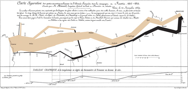
Charles Minard's 1869 chart showing the losses in men, their movements, and the temperature of Napoleon's 1812 Russian campaign.
Beginning at the Polish-Russian border, a thick band shows the size of the army at each position. A dark lower band traces the path of the retreat from Moscow in the bitterly cold winter. Every millimetre on that black line represents ten thousand dead men.
The size of the army provides a strong visual representation of human suffering. It shows a sudden decrease of the army's size at the crossing of the freezing Berezina River on the retreat. Latitudes and longitudes are shown for important places on the trek. The map indicates where units split off and rejoined. It incorporates temperature and time scales.
Étienne-Jules Marey first drew attention to this masterpiece. He said it “defies the pen of the historian in its brutal eloquence”.
Howard Wainer identified Minard's map as a “gem” of information graphics, nominating it as the “World’s Champion Graph”.
Edward Tufte says it “may well be the best statistical graphic ever drawn”. He uses it as a example in The Visual Display of Quantitative Information. On page 40 of that classic textbook, he states, “Minard's graphic tells a rich, coherent story with its multivariate data, far more enlightening than just a single number bouncing along over time. Six variables are plotted: the size of the army, its location on a two-dimensional surface, direction of the army's movement, and temperature on various dates during the retreat from Moscow”.
Minard used his incomparable skill to show the horrors of war. A picture is worth a thousand words, or as Napoleon himself is reputed to have said, “A good sketch is better than a long speech”. Truly, war is Hell. A fuller article, by Helen Joyce, on Minard’s famous map is in Significance, September 2008, here.
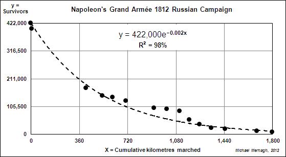
Based on Minard’s data2, I derived the following mathematical model and graph.
If x = the cumulative number of kilometres marched and y = the number of survivors in Napoleon’s Grand Armée, then y = 422,000exp(-0.002x) is an exponential decay model of the 1812 campaign in Russia.
From beginning to end of the disastrous campaign, the number of survivors halved every 360 km. The 4,000 who survived had marched an overall total of 1,800 km.
References
-
1. Minard's Eternal Silences by Nicholas Jenkins
http://www.stanford.edu/~njenkins/archives/2008/10/minard.html
- Re-Visions of Minard by Michael Friendly http://www.datavis.ca/gallery/re-minard.php


