
With the rapid global spread of Covid-19 in recent weeks, many comparisons have been made between the number of cases in different countries. Italy was one of the first in Europe to be badly hit by the pandemic and imposed a full lockdown on 12 March. The effects of Covid-19 were felt later in the UK, with the lockdown coming on 24 March. It is therefore of interest to compare the progress of the disease in Italy to the countries of the UK. To do this we use publicly available data1,2 and statistical models including logistic growth to address the questions, “Is the increase in the number of documented cases of Covid-19 slowing down?” and “How soon do changes follow from lockdowns?”.
By documented cases, we mean the number of positive tests recorded as “totale_casi” in the regional Italian data1 and as “ConfirmedCases” in the England, Northern Ireland, Scotland and Wales data2. An easy to understand handle on the spread of an epidemic can be given by the time it takes for the number of cases to double. Although the estimation of these daily doubling times is not straightforward, examining how they change from day to day can provide us with additional insights. We now discuss in detail two statistical models that are widely used in the context of epidemics.
Two growth models
The first model we look at is a geometric growth model. You may have read or heard media reports talking about “exponential growth” in the number of documented Covid-19 cases, but “exponential growth” is just a different mathematical way of writing “geometric growth” and, essentially, the terms geometric and exponential can be used interchangeably in what follows.
One important thing to know about geometric growth is that it is fast. In finance it is the type of growth associated with compound interest. Say that you invest £100 at an interest rate of 10% compounded annually. After 1 year, you will have £110. After 2 years, you will have £121. After 8 years, your investment will be worth £214, so that the initial £100 would have doubled in that time. We could have obtained this result for annually compounded interest by approximating from above by a whole number the value log(2) / log(1 + 0.1) = 7.27 years, in which the 0.1 represents 10%.
Doubling time is constant across time with geometric grown. In the context of the number of documented cases of a disease like Covid-19, geometric growth is illustrated in Figure 1 by the red curve. Geometric growth increases quickly without an upper limit. It is therefore an inappropriate model for Covid-19 cases over a long period of time, as the size of a population places an upper limit on the total number of cases. It can, however, provide a useful model for the number of cases in the early stages of a pandemic.
Logistic growth, illustrated by the black curve in Figure 1, is initially similar to geometric growth, but then increases less quickly before tending to an upper limit. It is therefore more suitable for modelling the long-term behaviour of epidemics. Moreover, the logistic growth model is influenced by the deterministic SIR model,3,4,5 based on the number of susceptible, infectious, and recovered individuals.
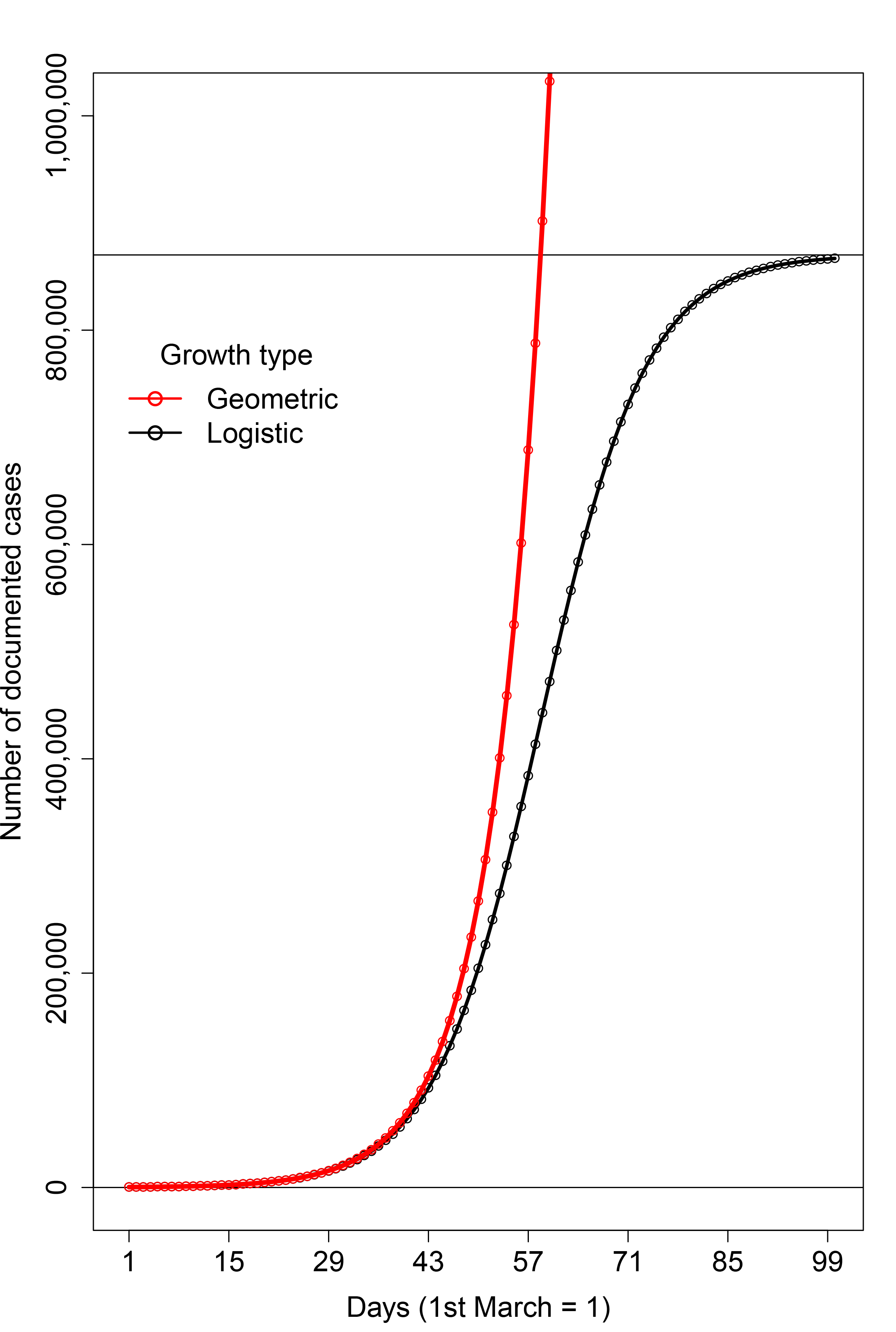
FIGURE 1 A hypothetical example of the two growth models that we discuss. Geometric growth (red) is rapid growth without limit, while logistic growth (black) tends to an upper limit (upper horizontal line).
Results
The number of documented cases of Covid-19 for the whole of Italy is shown in the top left panel of Figure 2, together with the fitted logistic growth model, which explained these data better than geometric, or geometric followed by logistic growth. The bottom left panel of Figure 2 shows the derivative or gradient (in cases per day) of this logistic growth model.4 It can be useful to interpret the gradient as speed. Say you are driving from home to work (only if permitted!). Initially, you go quite slowly, but then conditions allow you to accelerate until you reach your maximum speed. Then, you start to decelerate, until you arrive and stop. Although your speed increases and then decreases, your distance from home is always increasing. If we now apply this interpretation to the Italy column of Figure 2, we see that at first the number of cases increases rapidly, but, around 26 days (rounded to a whole number, 26 March), the rate of this increase slows down. Ideally, this rate will go down to zero, meaning that the number of documented cases does not change from one day to the next. We have seen similar logistic growth behaviour in many Italian regions and provinces (and we provide extensive additional results for Italy elsewhere6).
For Italy, the peak (or maximum speed) of the derivative graph comes approximately 17 days after the Italian government imposed a lockdown on most of the north of Italy including the badly hit Lombardia/Lombardy region on 9 March and 14 days after the strict nationwide lockdown on 12 March, suggesting that this drastic action had some effect after just over a fortnight. But though the bottom left panel of Figure 2 provides us with a positive message, it must be emphasized that any changes in people’s cooperation with the lockdown7 may reverse these improvements.
Graphs for England and Northern Ireland are also presented in Figure 2, with again the number of documented cases showing logistic growth. To save space, we do not display graphs for Scotland or Wales, which show similar logistic growth. The positions of the turning point for England, Northern Ireland, Scotland and Wales are at 38, 37, 36 and 37 days, respectively, corresponding to 7, 6, 5 and 6 April. It is therefore clear from Figure 2 that the epidemic in the UK is at an earlier stage of development than in Italy.
The changes in behaviour for England, Northern Ireland, Scotland and Wales occur at 14, 13, 12 and 13 days after the full UK lockdown, whilst the corresponding range for Italy is 14–17 days, as mentioned. Italy and England have similar population sizes, so it could be that the shorter time between lockdown and deceleration in cases is due to the lower epidemic level at which lockdown was imposed in England. This may be very important when it comes to relaxing the lockdown, as it tells us that the lockdown should be re-imposed as soon as possible if the number of cases shows strong acceleration. The smaller population sizes of Scotland, Wales and Northern Ireland may account for the shorter delays before deceleration. The fact that more people live in rural areas in Wales and Northern Ireland than in other countries of the UK may be another contributory factor. It would be of interest to gain a better understanding of the time between lockdown and deceleration for different countries.
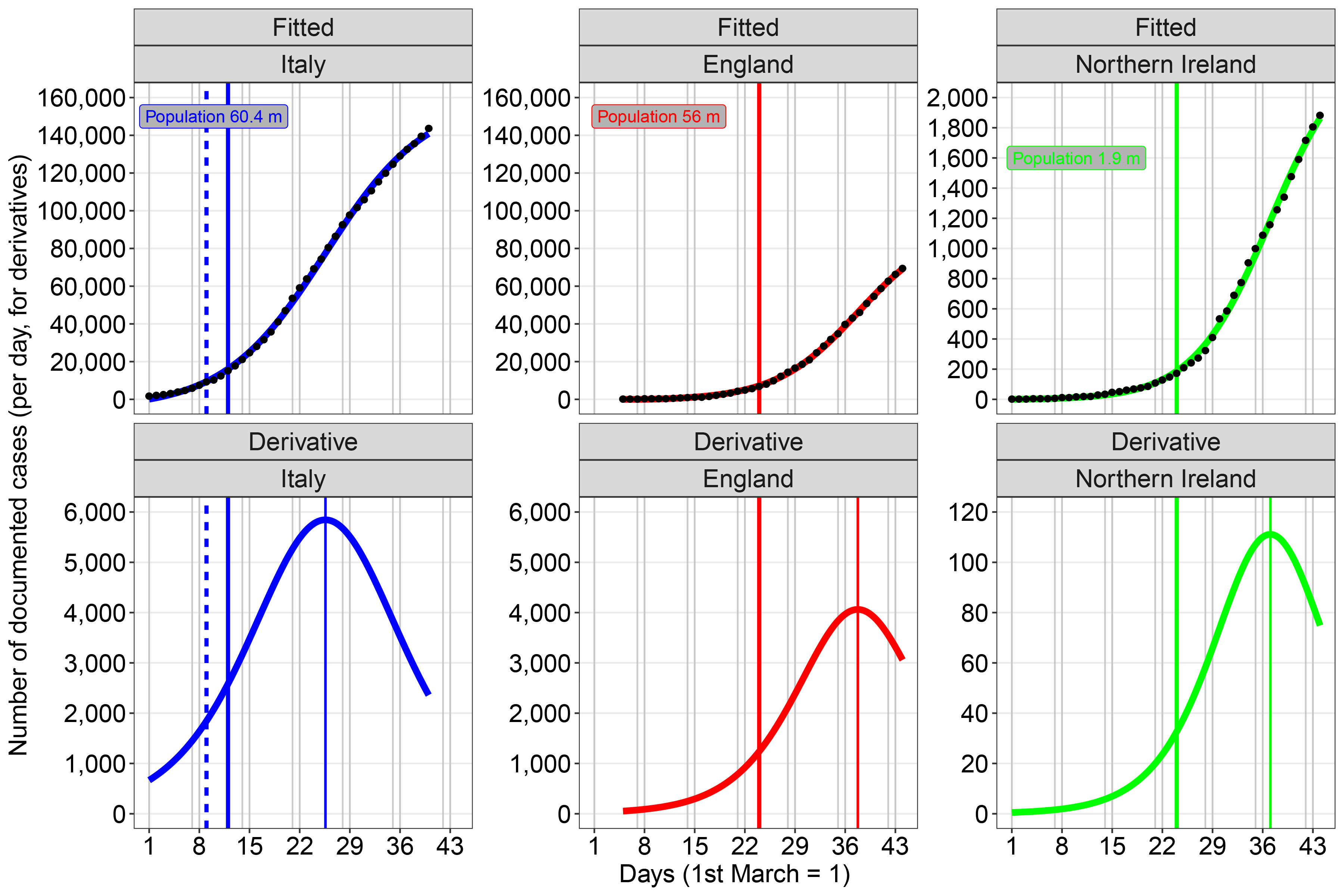
FIGURE 2 Top row: the number of documented cases of Covid-19 plotted against day starting from 1 March 2020 for Italy, England and Northern Ireland, together with the best fitting (logistic) model. Bottom row: the derivative or gradient of the models shown in the top row; the thin vertical lines show when the increase in the number of cases starts to slow down. The thicker vertical lines indicate when lockdowns came into effect: most of north Italy, 9 March (dashed line); all of Italy, 12 March (unbroken line); all of UK, 24 March. Weekends are also shown. The same vertical scales are used for England and Italy as these countries have quite similar population sizes.
Doubling times
When discussing geometric growth, we introduced doubling time by means of a financial example based on compound interest. For the Covid-19 pandemic, the doubling time is the number of days for the documented cases to double. The doubling time can be easily found when a geometric growth model is used. We estimated using 14 days of data up to and including 20 April that the doubling times for cases in the whole of Italy and in England are approximately 31.6 and 13.9 days, respectively. However, as we have seen that the number of Covid-19 cases in Italy and England can be better modelled using logistic growth, we need an alternative way of estimating doubling time that can change from day to day.
Our estimate of doubling time on a particular day is the least number of days that we have to go back to find a day when the number of cases is half or less of its current value, if such a day exists. Figure 3 shows our day-to-day estimates of doubling time for Italy, England and the Lombardy region of Italy using points. We have also added smooth local regression curves across time obtained from the R package “ggplot2”.8 We do not report a doubling time if the latest day when the number of cases is half falls before 1 March, for reasons we discuss later. Figure 3 confirms that the epidemic in England is at an earlier stage than in Italy. It also tells us that the early imposition of restrictions in Lombardy – and perhaps the more developed health care system – have meant that the growth of the epidemic has become less fast there than in Italy as a whole. However, because of the original severity of the outbreak in Lombardy, the regional government remains extremely cautious.9 We note that the doubling time estimates presented in Figure 3 seem to show some sensitivity to the positions of the lockdowns. Indeed, deviations from the constant doubling time behaviour associated with geometric growth happen almost immediately after lockdown.
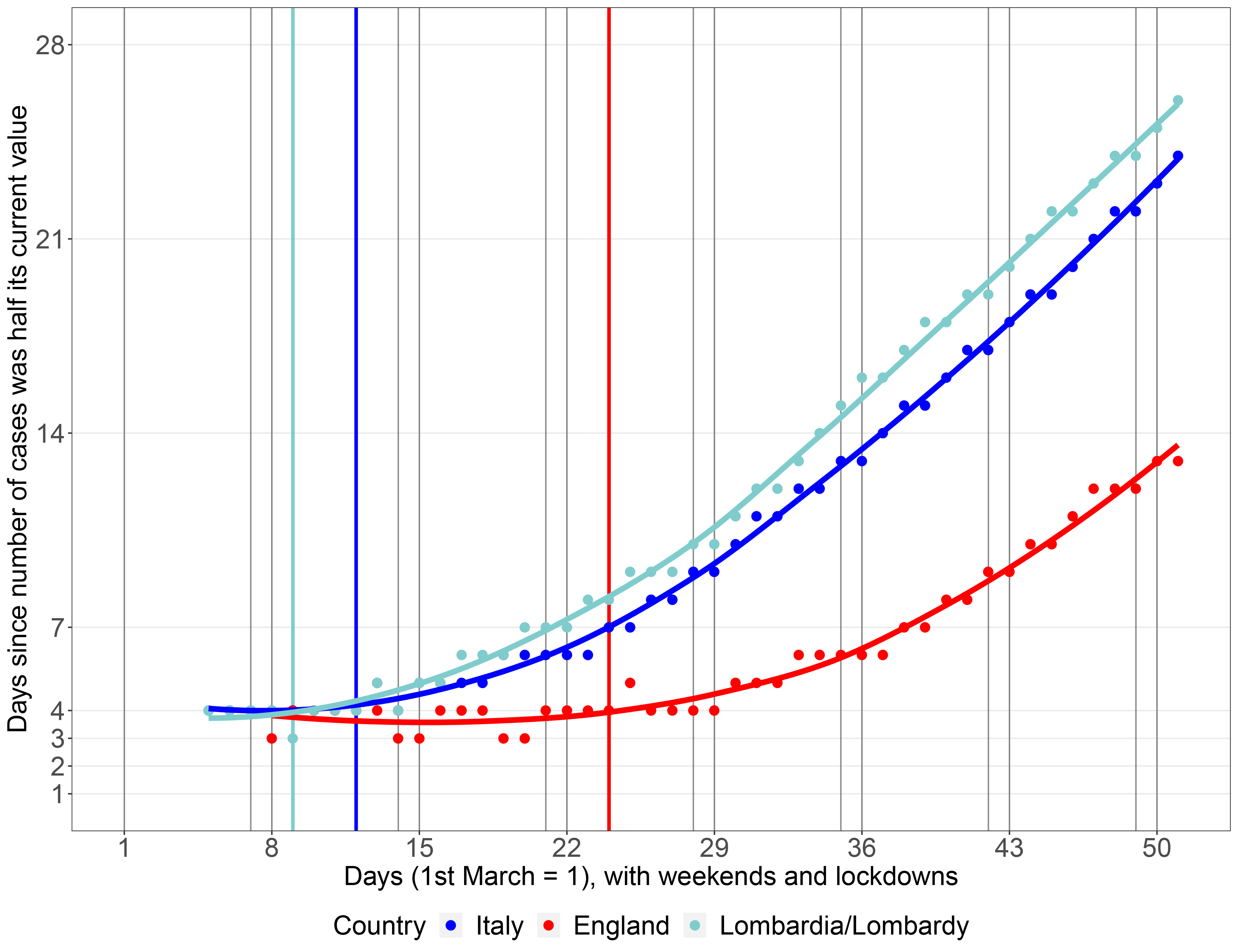
FIGURE 3 Day-to-day estimates of doubling times (points) for Italy, England and Lombardy, with smooth curves across time (lines). The lockdowns as described in the text are shown by the vertical lines. Increasing doubling times indicate that the growth in documented cases is slowing down, which is a positive public health message.
Caveats and discussion
We have not quantified uncertainty in our plots, although doing so is “bread and butter” for statisticians. There are many sources of uncertainty associated with Covid-19 estimates, one of which is due to differences in the testing strategies that lead to the documentation of cases. For example, the effects that we illustrate may also be dependent on the incidences of testing, if this led to many cases being quickly found initially, followed by a settling down. We must therefore be aware that changes in doubling time slopes may be due to differences in who is admitted to testing.10 Nevertheless, because evolution patterns remain valid when there are no changes in testing strategy, we have only considered data from Italy from 1 March from when a consistent testing regime has applied. In addition, there may be covariates that we should include in our models. We could also have conducted a similar analysis for the number of deaths, or the ratio of the number of deaths to the number of documented cases, possibly lagged.
We emphasize that our doubling time estimates are based on looking back in time. We plan to improve our estimates of doubling time and to use them and the derivatives that we have discussed to provide much needed early warnings of disease flare-ups as restrictions are relaxed.
The derivatives and doubling times that we have presented allow us to address the question, “Is the increase in documented Covid-19 cases slowing down?”. The derivative plots tell us that the increase shows very strong signs of slowing down in Italy and the day-to-day increases in doubling times help to confirm this. They also allow us to see that the epidemic is now growing less quickly in Lombardy than in Italy as a whole. Substantial improvements took place approximately two weeks after the nationwide lockdown. The UK is at an earlier stage of the Covid-19 epidemic than Italy and the effect of the lockdown has been felt somewhat more quickly. We hope that suitably-managed lockdowns will allow the whole world to move quickly forward to a healthier and brighter future.
References
- COVID-19 Italia – Monitoraggio situazione. ^
- Coronavirus (COVID-19) UK Historical Data. ^
- Kermack, W. I. and McKendrick, A. G. (1927) A contribution to the mathematical theory of epidemics. Proceedings of the Royal Society A, 115, 700–721. ^
- Sebastiani, G. (2020) Analisi dei dati epidemiologici del coronavirus in Italia: nota metodologica. ^
- Ball, P. (2020) How do epidemiologists know how many people will get Covid-19? Significance. ^
- Sebastiani, G. and Massa, M. (2020). ^
- Finazzi, F. and Fassò, A. (2020) The impact of the Covid-19 pandemic on Italian mobility. Significance. ^
- Wickham, H. (2016) ggplot2: Elegant Graphics for Data Analysis. Second Edition. Springer-Verlag New York. ^
- Why Lombardy is set to double total lockdown period compared to rest of Italy. ^
- Hyndman, R. J. (2020) Why log ratios are useful for tracking COVID-19. Hyndsight, 5 April 2020. ^
Acknowledgements
We are grateful to the following people for stimulating discussion: Daniela Antonelli, John Eales, Luisa Franconi, Beatrice Giglio, Howard Grubb, Merrilee Hurn, Marion Johnston, Ben King, Marco Massa, Daniela Pesce, Maria Rita Sebastiani, Simon Shaw and Katerina Tzioli.
About the authors
Giovanni Sebastiani is senior researcher at the Istituto per le Applicazioni del Calcolo “M. Picone” of the Italian National Research Council. He develops statistical and physical models for medicine, seismology and medical imaging.
Julian Stander is associate professor in mathematics and statistics, Centre for Mathematical Sciences, University of Plymouth. He has applied Bayesian statistical methodology to a range of application areas and is also interested in statistical education.
Mario Cortina Borja is chairman of the Significance editorial board, and professor of biostatistics in Population Policy and Practice Teaching and Research Department, at the Great Ormond Street Institute of Child Health, University College London. He has worked in many scientific areas as an applied statistician.


