
All in all, there appear to have been 14 publicly-issued forecasts concerning which countries would win the most medals overall, with many of these predictions taking the form of a top-10 list (or, in one case, a top-8 list). Remarkably, every one of these 14 forecasts had the same eight countries – USA, China, Russia, Great Britain, Germany, Japan, Australia, and France – finishing in some order in the top eight places of the “total medals” table (though one forecast, by Bredtmann, predicted that Brazil would tie for 7th alongside France and Australia). These are, in fact, the eight countries that won the most medals overall at London 2012.
However, while all the forecasts agree on who the eight “big hitters” are, they have differing opinions on the final medal counts. The chart below displays the predicted number of medals achieved in Rio 2016 by each of these eight “big hitters” according to the 14 forecasts, which are ordered in reverse chronology, beginning with the most recently issued forecast and working backwards. (For visual clarity, the eight countries are listed in the same order for every forecast, and we have based this order on the total medals table for London 2012: USA, CHN, RUS, GBR, GER, JPN, AUS, FRA.)
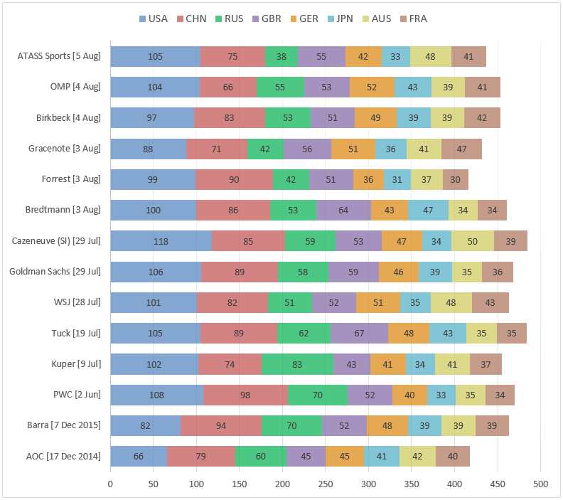
The original sources for these forecasts are provided at the bottom of this article, in the order that they appear in the chart; many of these numbers (with the exception of the forecast from Birkbeck) have also been aggregated in tables on the excellent website TopEndSports.
We note, in passing, that while the “total medals” table is by far the most forecasted outcome of the Games, and most indicative of overall dominance, a similar chart to the above could be generated for “total gold medal” predictions. We restrict attention here to the “total medals” table.
(South) America’s Next Top Model…?
Based on the text accompanying each of the 14 forecasts, it is apparent that a wide variety of different methodologies have been adopted to create the predictions.
Perhaps most intriguingly, almost half of the forecasts do not make use of any detailed sporting data, but instead model performance based on “macro” economic indicators for each country coupled with overarching measures of sporting prowess such as the medal tallies at previous Olympic Games, with adjustments being made for additional factors such as being the “host” nation. Six of the forecasts follow this kind of approach: Forrest, Bredtmann, Goldman Sachs, Tuck, Kuper, and PWC.
The other eight forecasts do make use of detailed sporting data, though in most cases this information is either being interpreted subjectively by sports experts to generate the predictions (as in the case of Barra and AOC), or is being used to try and “pick the medallists" in each event (which is the general strategy followed by OMP, Birkbeck, Gracenote, and Cazeneuve – though the exact implementation details are not public).
However, while it is clearly valuable (and extremely interesting!) to be able to identify the most likely medallists in every event, there is a subtle shortcoming to creating an overall medal forecast by simply identifying the top three competitors in each event and then aggregating over all events – namely, this strategy fails to properly account for the probabilities of athletes lower down the rankings scooping a medal instead. To quickly illustrate this idea, consider a hypothetical event in which the top three competitors come from countries A, B and C respectively, the fourth-best and fifth-best competitors both hail from country D, and the sixth (and weakest) competitor represents country E. In this instance, a “pick the medallists” strategy would assign the gold, silver and bronze medals to countries A, B and C, and would therefore treat countries D and E as having the same chance of a medal (namely, zero), when in reality, country D clearly has a much greater probability than country E of ending up on the podium. (In fact, depending on the relative abilities of our hypothetical competitors, country D might even be more likely than country C to win a medal.)
This phenomenon suggests that to get a proper handle on each county’s final medal tally, it may be valuable to broaden our perspective: rather than trying to “pick the medallists” in each event, we should instead model all of the possible outcomes probabilistically – even those that seem unlikely to occur.
The forecasts produced by the ATASS Sports research team were constructed in exactly this way, with every one of the Olympic events being modelled separately by our statisticians. This process allowed us to specify a complete probability distribution over the possible medal outcomes for each event, and our overall medal forecasts were then generated by simulating the entirety of the Games hundreds of thousands of times, and aggregating the outcomes. (Interestingly, as noted in the article accompanying the Wall Street Journal’s forecasts, some of the key elements of this methodology also appear to feature in the WSJ's approach, in which “a probability of success [is] assigned to each event participant”.)
Although developing such a probabilistic model is undeniably time-consuming, and requires not only a substantial quantity of data but also a large team of researchers, one of the major advantages of the approach is that it allows us to easily assess the probabilities associated with other events of interest, such as teams finishing in certain positions, or specific medal targets being reached. For instance, as shown in our forecast document, we calculated that the USA had a 97% chance of finishing top of the medals table, and that the GB Swimming Team had a 74% chance of exceeding their “maximum” target of 5 medals.
Let the Games begin
By far the most interesting property of the above forecasts is how closely they will end up matching the final medal table from Rio – an informal contest that we might dub “The 2016 Prediction Games”. Obviously, which of the forecasts performs best will remain unknown until the Olympics have concluded, so we will review the numbers again in a “Part II” follow-up article once the overall medal table has been finalised.
For transparency, it’s worth making three remarks in advance concerning the nature of this comparison:
1. Eight is the magic number
Given the agreement across all 14 forecasts on the identities of the eight “big hitter” countries (after which the forecasts quickly start to diverge), it would seem that the most natural way to assess the success of the 14 forecasts after the conclusion of the Games would be to compare the predicted and observed medal tallies across these eight countries using the mean squared error metric (i.e. the winning forecast is the one whose mean squared distance from the observed medal totals is smallest), or the mean absolute error metric (i.e. the winning forecast is the one whose mean absolute distance from the observed medal totals is smallest). Both of these methods are well-established, simple, and transparent.
As some of the forecasts only predict the top 10 (or top 8) finishers, it isn’t possible to enlarge the comparison set beyond the eight countries named above unless we are happy to drop some of the forecasts out of the running. If we did wish to extend the analysis to a larger comparison set of countries (after eliminating any forecasts without the necessary information), it should then be recognised that the choice of how many countries to compare – and which countries these are – is a very significant decision, and one that is almost certain to influence the final answer obtained. Thus, any such comparison made on an extended list of countries should be checked for its sensitivity to the choices that have been made.
On a specific methodological point, it seems unwise to select the countries for comparison to be the top N finishers in the 2016 Games, for some particular value of N. Although this policy seems at first to be quite natural, it is potentially subject to “gaming” in the sense that it does not elicit truthful forecasts. For illustration, consider the case N=10: that is, the comparison set will be just the countries that finish in the top 10 of the total medals table. If the forecaster knows in advance that this will be the assessment metric, it would be beneficial for her to artificially inflate the forecasts for countries lying outside her top 10, because she knows that these predictions only count if the relevant country over-performs enough to finish inside the top 10 – and in that case, its observed number of medals will certainly be higher than normal. The “top N finishers” scheme also suffers from the reverse problem: if one of the most favoured countries substantially under-performs and actually ends up finishing outside the top N, then there is no punishment suffered by forecasts which backed that country to do particularly well.
For these reasons, it makes most sense for the forecast comparison to be performed across the fixed set of eight countries identified earlier – USA, China, Russia, Great Britain, Germany, Japan, Australia, and France – rather than making the comparison set contingent on the outcome of the Games.
It is surprising that such an apparently simple task – deciding how best to judge which forecast is closest to the observed values – is fraught with so many hidden pitfalls.
2. Russian roulette
For this year’s Games, a significant element of unpredictability has been introduced by the uncertainty over how many of Russia’s athletes would be barred from competing in the Games in the wake of the recent doping scandal – an issue highlighted in many of the forecasts. In this respect, earlier forecasts issued during June or July may have inadvertently overestimated the likely number of Russian medals – and indeed, this pattern is evident in the chart above, with the green segment narrowing noticeably over time. (Of course, any of these earlier forecasts could have been updated closer to the Games to reflect the latest information on Russia – though the Bredtmann forecast appears to be the only one to have been publicly revised.)
As a side note, it is interesting that the six most recent forecasts in the chart (all issued the week before the Games began) seem to divide into two distinct camps on the likely Russian medal haul, with OMP, Birkbeck and Bredtmann being much more bullish on Russia’s prospects than ATASS Sports, Gracenote and Forrest.
3. Confidence tricks
Like all the groups of researchers who have provided predictions, we have tried to give our best possible forecast of the medal total achieved by each country, but there is of course considerable random variation in how the Games will play out. Accordingly, it may be illuminating to give a sense of what we estimate the confidence intervals to be around our numbers.
At the top of the table, our 50% confidence interval for the total number of USA medals is [101 to 109], while our 95% confidence interval is [94 to 116]. Note that this latter interval comfortably includes the values of all other USA predictions made since June, with the exception of Gracenote (88) and Cazeneuve (118). (Incidentally, the vast gap of 30 medals between the Gracenote and Cazeneuve forecasts is particularly striking, given that both forecasts appear to rely on similar approaches – we shall see in due course which one turns out to be closer to the truth!) Proceeding further down the top 8, we find that the width of our confidence intervals gradually narrows as the expected number of medals falls – for instance, for Great Britain, our 50% and 95% intervals are approximately [52 to 58] and [46 to 64] respectively, while for Japan, they are [31 to 35] and [26 to 40] respectively.
Assuming that the widths of the confidence intervals associated with other forecasts are roughly comparable to ours, it should be apparent from the above chart that many of the predictions lie extremely close to one another – with a small number of anomalous exceptions – and in some cases, the differences are well within the bounds of random variation. So, if our forecasts do happen to do well in any post-Olympics analyses, we are confident in saying that this is down to a combination of the model providing an accurate approximation of reality, plus a healthy dollop of good fortune!
- Check back soon for Part II of this article, after the 2016 Games have concluded.
- Dr Tim Paulden is innovation and development manager at ATASS Sports.
Sources
OMP (Olympic Medals Predictions)
Germany's values are not given on the front page of the OMP site, but are accessible via the individual country pages.
Birkbeck (Professor Klaus Nielsen)
Bredtmann et al.
The medal tallies after re-allocating the 24 Russian medals have been used; original article published in Significance, June 2016
Cazeneuve (for Sports Illustrated)
Tuck School at Dartmouth (Camila Gonzales)
Kuper et al.
Taken from the paper “Wie zijn de winnaars in Rio de Janeiro?”
AOC (Australia Olympics Committee)
NB. An aggregated list of predictions is provided on the TopEndSports website


