Unlike the 2015 general election, when the polls were essentially static (and wrong) throughout, the 2017 general election has seen some of the most extraordinary volatility in the polls that I can remember. If you are a Conservative supporter, the narrowing lead over Labour must be leading to anxiety and changed underwear. If you are a Labour supporter, you are probably starting to dream “can we? will we?!”
It doesn’t help that your state of mind will depend on which poll you are reading, and your memories of the pollsters’ failure in 2015. So how can you make sense of what is going on? I will show you how in five steps, but I will leave my prediction until the very end!
The charts below (labelled G4 and G5) show the narrowing of the CON-LAB lead since the manifestos were published.

The narrowing of the CON-LAB lead is mostly due to the rise in the Labour vote. The Conservatives have lost votes over the last two weeks but they are still at a higher level than they were before the election was called, and a final vote share of 43.7% would still be higher than Thatcher’s landslides in 1983 and 1987. It is the 12 percentage-point (pt) rise in the Labour vote that has changed everything. A quarter of that increase comes from Conservatives switching to Labour, while the other three quarters has come from the Greens, Liberal Democrats, UKIP and Nationalists. So this raises the question, is the Labour recovery due to pro-Labour enthusiasm or an anti-Tory tactical vote? We will find out tomorrow (8 June). For now, though, I’ll walk you through my five steps for making sense of the polls.
Step 1: Divide the pollsters into two groups based on their turnout methodology
The pollsters need to be split as follows:
- Modeller group includes ICM, Comres and TNS.
- Self-Report group includes everyone else.
If you do this and calculate the average CON-LAB lead across all polls published by the two groups, and do this for six different time periods, a clear pattern emerges, as shown in the chart below:

The manifestos were published just before the Manchester bombing and the effects appeared in the polls afterwards. The labels show the average GB vote shares for the Conservatives (C) and Labour (L).
This chart clarifies many things straightaway. Depending on how you are estimating turnout, you will either be saying that the CON-LAB lead has fallen from 7.4pts to 5.4pts, and is now lower than the 6.5pt lead the Conservatives had in the 2015 election, or you will be saying that the CON-LAB lead is still 11.5pts and 5pts better than 2015 for the Conservatives. Whilst the gap between the two methods has widened in the last few days, there has been a persistent gap since the start of the year. Before the election, the Self-Reports had the lead 2pts lower than the Modellers, but once the election was called the gap widened to 4pts and then to 6pts in the last few days.
Step 2: Decide who has the better turnout model, Modellers or Self-Reporters?
Why are the two groups so different? The answer is that turnout modelling takes into account two factors and your estimated turnout will depend on how much weight you are giving to each.
- The intention to vote as expressed by the survey respondents.
- The historical turnout among different demographic groups.
The Modellers are placing much greater weight on historical turnout among various demographics. The most important by far is age, as the chart below shows. You will note that young people are much less likely to vote and historically this group is much more likely to vote Labour. Note that the author of this chart stated later that the 2016 turnout for 18-24 year-olds was incorrect and should have been 47%.
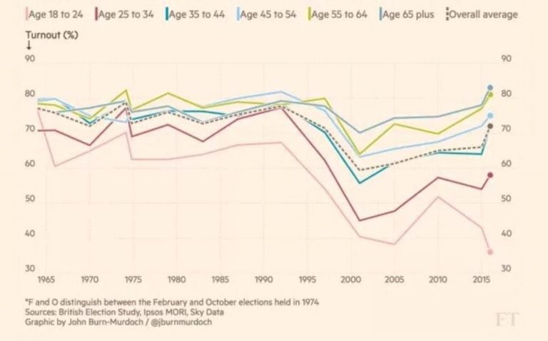
By contrast, the Self-Reporters give greater weight to what survey respondents say about their likelihood to vote. I have seen analyses that claim the implied turnout among 18-24 year olds among Self-Reporters is over 60% which is much higher than the 47% seen in the referendum. There is no question that the widening gap between Self-Reporters and Modellers is due to younger voters (especially women) apparently becoming more enthusiastic about voting, and with their pro-Labour bias it is no surprise that Self-Reporters have seen a rapidly narrowing CON-LAB lead. By contrast, Modellers, who place much greater weight on historical turnout, see little change over the last few days.
So who will be more correct on Thursday? I have heard a lot of talk about this being a key election for young voters “to stop their future being stolen”. But tweets and social media posts are far too easy to mistake for genuine enthusiasm, and history is a powerful force to overcome. The following points make me sceptical about the supposed enthusiasm of young voters.
- Nearly all pollsters have now switched to online panels. Only Ipsos Mori and Survation are still carrying out phone polls. Online panels correctly predicted a Leave vote in 2016 whereas phone polls predicted a Remain vote. But online panels always run the risk of recruiting techphiles and missing techphobes, and the young are certainly more likely to be the former. The second risk is the ease of recruiting politically-engaged voters who again tend to be more pro-Labour, and this was ultimately blamed for the polling error of 2015. Finally, getting the referendum right doesn’t mean you will get the general election right, and I have demonstrated that the demographics of the Leave vote bore almost no relation to the demographics of the 2015 election.
- In 2014, for its referendum on independence, Scotland recorded its highest-ever turnout of 85% – a 21pt increase on the 2010 general election turnout of 64%. A year later, during the 2015 general election, Scottish politics was shaken up by the SNP taking 50% of the vote (up 30% on 2010) and all but wiping out Labour, who had dominated in Scotland for decades. In the aftermath of this election, it was claimed that ‘No’ voters in the referendum “had stolen the future of the young”, and so this political realignment represented an enthusiasm among ‘Yes’ voters to change things. It’s a familiar narrative, but it’s not borne out by the turnout figures, which fell from 85% in 2014 to 71% in 2015. This equates to two-thirds of the additional voters in 2014 not bothering to vote in 2015, despite all the enthusiasm and incentive to do so since the polls were forecasting a hung parliament – giving the SNP an opportunity to play kingmaker. This is a real data point to take into account.
- Converting young votes into seats is going to be harder than Labour thinks. The polls are showing that Labour are closing the gap best in major cities and the South, but these are the wrong places to pick up these votes. For a start, seats with a large proportion of young voters tend to be Labour in any case. For example, in 2015 the Tories only had 11 of the top 67 seats where students outnumber retired people in England and Wales. Such seats are often university towns. In the South, Labour is a long way behind the Conservatives and whilst they are closing the gap, it is not yet enough to significantly hurt the Conservatives. If Labour want to inflict damage on the Conservatives, they need to protect their seats in the North and make gains in the Midlands, and they are not doing this.
Having said all that, Modellers will get it wrong if this election turns out to be a game-changer. I have already explored the likelihood of 2017 being a realignment election and I concluded that any realignment would favour the Conservatives, such as them becoming the party of the working class. If something like that could happen, then there is nothing to stop young voters increasing their turnout as well, in which case Self-Reporters will be more likely to get it right.
I have decided to use the Scottish data point I referred to as a way of deciding between the two methods. I am taking a weighted average of the Modellers CON-LAB lead of 11.5pts (2/3 weight) and the Self-Report CON-LAB lead of 5.5pts (1/3) weight which gives an expected CON-LAB lead of 9.5pts, 3pts higher than the current combined average CON-LAB lead of all polls, which is 6.5pts (the same as 2015). In effect, I have decided that the Modellers are assuming unchanged turnout of 66% in 2017 and the Self-Reports are assuming a turnout equal to the referendum of 72%. My weighted average implies an expected turnout of 68%. This estimate replicates the changes seen in Scotland where a 21pt increase in turnout from 2010 to 2014 was followed by a 14pt fall in turnout in 2015, ie 2015 turnout was 2/3 of 2014 plus 1/3 of 2010.
In doing this, and arriving at a CON-LAB lead estimate 3pts higher than the polls, I have effectively assumed that the poll average will be in error by 3%. This is very close to the long run 2.6% underestimate in the CON-LAB lead I identified from analysing polling errors from 1945 to 2015. The nature of the error, though, is different this time. In 2015 all pollsters got it wrong, but in 2017 I am saying some will get it right. Of course there is nothing to stop there being additional polling error on both sides of the turnout debate, on top of what I have been describing here.
Step 3: Decide if you can use Uniform National Swing (UNS) to predict seats
Once you have decided on your turnout model, this will give you your projected CON-LAB lead. Suppose we assume that Self-Reporters are right and the CON-LAB lead will be 5.5pts in Great Britain in 2017. This would be 1pt lower than the CON-LAB lead of 6.5pts in 2015. How many seats would this cost the Conservatives?
Uniform National Swing (UNS) is a method that assumes that if the CON-LAB changes by 1pt at a national level, on average the CON-LAB lead in every seat will also change by 1pt. So any seat with a Conservative majority of less than 1pt will be lost in such a scenario. How many seats are there that fit this scenario? The answer is six, and they are listed below.
- Croydon Central (London)
- Derby North (East Midlands)
- Gower (Wales)
- Vale of Clwyd (Wales)
- Bury North (North West)
- Morley & Outwood (Yorkshire), Ed Balls’ former seat.
You will notice only one of these seats is in the South, Croydon Central. I stated earlier that Labour is doing better in major cities and the South than in the Midlands and North, and I based this on chart R1 of my opinion poll tracker. This chart is based on the latest polls (both Self-Reporters and Modellers) and predicts a CON-LAB lead nationally of 6.5pts, exactly the same as 2015.
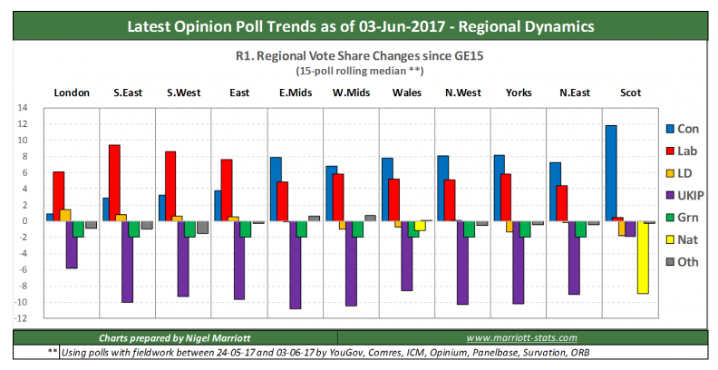
In the Midlands, the North and Wales, far from closing the gap on the Conservatives, Labour are losing ground. Yes, they are gaining votes in these areas, but the Conservatives are gaining even more with the result that either the CON-LAB lead is getting larger (Midlands) or the LAB-CON lead is getting smaller (the North and Wales). In London and the South, Labour are making larger gains than the Conservatives and are narrowing the gap by 5pts or so. But the Conservatives have very few seats in the South with such majorities, and the list below is all that Labour would gain in London and the South based on the changes shown in R1.
- Croydon Central (London)
- Brighton Kemptown (South East)
- Southampton Itchen (South East)
- Thurrock (East)
- Bedford (East)
- Plymouth Moor View (South West)
- Plymouth Sutton & Devonport (South West)
At the same time, Labour would fail to take the other five seats I listed before in the North, Wales and Midlands, and instead the Conservatives would make the following seven gains based on chart R1, which would cancel out the above losses.
- NE Derbyshire (East Midlands)
- Halifax (Yorkshire)
- Dewsbury (Yorskshire)
- Chester (North West)
- Wirral West (North West)
- Barrow & Furness (North West)
- Lancaster & Fleetwood (North West)
Then there is Scotland. Chart R1 shows a dramatic change around, with the Nationalists down nearly 10pts and the Conservatives up 15pts and in second place. They are well set to win five to 10 seats and my forecast was eight.
So to summarise: Uniform National Swing is not a valid model as shown by the changes in chart R1. More than that, R1 predicts at a national level that the CON-LAB lead will be unchanged, but the regional redistribution of votes means that the Conservatives will make a net gain of eight seats. So, an unchanged CON-LAB lead increases the number of seats for the Conservatives which raises the question, what does the CON-LAB lead need to be for them to lose seats and their majority? The answer is to abandon Uniform National Swing and to use a non-Uniform Regional Swing (nURS) model instead.
Step 4: Take into account the variation in the Leave vote around the country
If you have been following my General Election forecasts, you should be familiar with my nURS model, which is one of two models I now use to make my 2017 predictions. nURS starts by working out the votes in each seat based on the changes shown in chart R1 and then adjusting the Conservative vote based on the extent to which the seat was above or below the regional average for their Leave vote share in 2016. Above-average Leave areas see higher Conservative votes, below-average Leave areas see lower Conservative votes.
If you are familiar with the referendum results of 2016, you may have already spotted this pattern in chart R1. In London (which voted Remain) and the South (which narrowly voted Leave), Labour is closing the CON-LAB gap. Elsewhere in England & Wales where the Leave vote was strong, the Conservatives are either extending their lead over Labour or closing the gap on Labour. Scotland has to be ignored here as the political debate is influenced by the Unionist/Natioanlist divide in addition to Brexit.
This pattern is shown better in the scatter plot below.
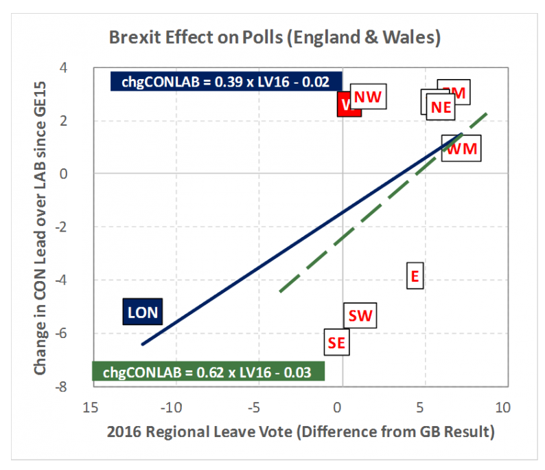
Along the horizontal axis, I have plotted each region’s Leave vote share as a differential from the national average of 52%. So London, which voted 40% Leave, has a differential of -12pts, and the South East, where just under 52% voted Leave, has a differential of effectively zero. On the vertical axis, I have plotted the expected change in the CON-LAB lead in each region from 2015 to 2017 based on the latest polls in chart R1. Fitting the blue solid line gives the equation of this fit in the blue label.
This is not a very good statistical fit, but it is still informative. The blue label says that there is a CON-LAB lead to Leave vote elasticity of +0.4, ie for every 1pt increase in the Leave vote, the CON-LAB lead increases by 0.4pts. However, London is quite an outlier in England and would be called a “high leverage” point in statistical terms, ie the parameters of the model as shown by the blue label are highly sensitive to any errors in the London estimate. I have in fact realised that in the past, my regional crossbreak analysis had a bias that overstated the CON-LAB lead in London which I have now corrected, but I may still be getting it wrong.
If I exclude London and recalculate the fit for English and Welsh regions outside of London, the elasticity increases to +0.62 and the fit is shown by the dashed green line. Again, the fit is not great, but bear in mind that the CON-LAB leads for all regions are simply estimates based on the polls and thus subject to error. However, +0.62 provides independent confirmation in my mind of the mathematical basis of my nURS model as shown in the next scatter plot.
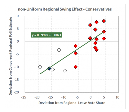
That model uses a CON to Leave vote elasticity of +0.7, which is close enough to +0.62 to decide that my elasticity is basically on the right lines. The second scatter plot is based on the five sub-regions of Wales (represented by red diamonds) from three Welsh Barometer polls, plus constituency-level polls in five strong Remain seats (Brighton Pavilion, Bath, Edinburgh South, Battersea and Kensington) which are represented by blue and white diamonds.
Having two independent analyses ending up with similar results gives me confidence that I have a way to measure the non-uniformality of the CON-LAB lead in each seat based on the Leave vote. If a seat’s Leave vote is higher than 52%, then for every additional 10pts in the Leave vote, the CON-LAB lead will be 7pts higher than the CON-LAB lead shown by the polls in chart R1. Conversely if a seat’s Remain vote is lower than 48%, then for every additional 10pts in the Remain vote, the CON-LAB lead will be 7pts lower than the lead shown in the polls by chart R1. I can now use my nURS model to answer the question, “At what level will the Conservatives lose their majority?”
Step 5: Identify the CON-LAB lead threshold for a working majority
Today, the Conservatives hold 330 seats out of 650 seats, which works out as a majority of 10 seats. At first sight, it would seem that if they lost five seats and ended up on 325 seats, they would lose their majority, but this is not correct. For a start, the Speaker is elected as an independent even though he was formerly a member of the Conservative party and is not counted in the 330 seats. In addition, the speaker does not have a vote, so if the Conservatives ended up with 325 seats, they would have a working majority of 1 seat.
In fact the working majority threshold is 323 seats due to the fact that the four Sinn Fein MPs do not take their seats in the House of Commons and, as such, do not vote. Out of 650 MPs, only 645 actually vote, which is why the working majority threshold is 323 seats. This means the Conservatives need to lose eight seats to scupper their working majority. I showed in Step 3 that the Conservatives can expect to gain seats even if the national CON-LAB lead remains unchanged at 6.5pts due to the way the votes are being redistributed unevenly by region. I will now use my nURS model described in Step 4 to generate an election forecast for a variety of CON-LAB leads, shown in the table below.
| GE 2015 result | GE 2017 5.4pt lead |
GE 2017 11.5pt lead |
GE 2017 6.6pt lead |
GE 2017 3.5pt lead |
GE 2017 9.5pt lead |
|
| 330 | CON | 341 | 382 | 348 | 322 | 367 |
| 232 | LAB | 233 | 194 | 225 | 250 | 208 |
| 8 | LD | 8 | 7 | 8 | 9 | 8 |
| 1 | UKIP | 0 | 0 | 0 | 0 | 0 |
| 1 | GRN | 1 | 1 | 1 | 1 | 1 |
| 66 | NAT | 55 | 54 | 56 | 56 | 54 |
| 12 | OTH | 12 | 12 | 12 | 12 | 12 |
| 15 | wMaj | 37 | 119 | 51 | -1 | 89 |
| CON-LAB lead elasticity (#seats per 1pt lead) | 7.2 | |||||
The first two CON-LAB leads represent the two groups of pollsters, Self-Reporters (5.4pt lead) and Modellers (11.5pt lead). Even if the Self-Reporters were correct, the Conservatives would gain 11 seats using nURS, which would mostly come from Scotland. However, I am sure Theresa May would be very unhappy to have only increased her working majority by 22 seats and that she is really hoping that the Modellers are right, where the Tories gain 52 seats and a 119-seat working majority.
The 6.6pt group represents the average of all polls and equates to an unchanged CON-LAB lead from 2015. Unlike what I said in Step 3, where I showed under uniform regional swing that the Conservatives would make a net gain of eight seats, under non-Uniform Regional Swing they would gain a further 10 seats. This is the impact of Brexit becoming the main factor of the election. Leave seats outnumber Remain seats by eight to five, and this increases the Conservatives’ gains.
To eliminate the Tories’ working majority, Labour has to get the CON-LAB lead down to 3.5pts, which is 3pts lower than 2015. This is 4th line in the chart I showed at the beginning of the post (repeated below) and appears as a solid brown line.
The 5th and final forecast in the table is for my assumed CON-LAB lead based on 2:1 weighted average of the Modellers and Self-Reporters as described in Step 2. So my official nURS forecast is for a working majority of 89 seats. Bear in mind that my official election forecast is the average of my nURS forecast and my Brexit Realignment model (EU16R) and in the past, EU16R has tended to give higher majorities than nURS, so it is quite likely that I will still be predicting a 100+ seat majority when I publish my final forecast.
The table shows you how the number of Conservative seats is related to the CON-LAB lead and the resulting elasticity is 7.2 seats per percentage point. So if you see a poll saying that Conservatives have an 8.5pt lead over Labour, you can start with 322 seats (the threshold for a working majority) and a CON-LAB lead of 3.5pts, subtract that from 8.5 to get 5pts and multiply that by 7.2 to get an additional 36 seats. This means the Conservatives can be expected to have 322+36=358 seats in this instance.
Obviously, any model will have a margin of error and I will be exploring that when I publish my final forecast. However, I know that my model has quite a few similarities with Lord Ashcroft’s approach, and if you visit his election forecast page you can see the likely range of errors.
And my prediction is…
I promised to make you wait! To those Conservative supporters chewing their nails and unable to sleep, my message is “calm down!”. To those Labour supporters daring to dream of success, my message is “don’t get your hopes up”. My official prediction, as of 4 June 2017, is available here.
About the author
Nigel Marriott is an independent statistician. He has previously written for Significance on the future of statistical thinking, and the 2015 UK general election.
This article is reposted from his blog, and was one of The Guardian’s recommended reads. Follow his election night commentary here.


