
The Covid-19 pandemic is a rapidly moving challenge. As countries and states scramble to meet this challenge in different ways, it can be difficult to follow and understand the data. Epidemiologists build models that incorporate a number of factors. But these are complex and must be updated as the data evolve.
As is often the case with data, the most extreme cases are both the most interesting and the ones that prompt action. In the pandemic, we want to know about places that have been particularly successful in managing the challenge (so that perhaps we can learn from them) and places whose failures are out of line (so that perhaps they can improve). But extreme cases are just the ones that models struggle to account for.
To identify a case as extraordinary, we must compare it to a base model. After all, there will always be a country with the most Covid cases. The question of interest is whether it has more cases than we should expect of the Covid leader.
In this note, we suggest a simple graphical tool based on a regularity in counted data that applies widely but does not depend on theory or require any special conditions. Figure 1 shows an example.
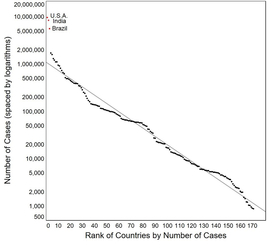
Figure 1: Number of Covid cases (plotted on a log scale) vs the rank for 171 countries of the world. (Data on 6 November 2020 from CNN.)
Figure 1 plots the frequency of the reported number of Covid cases (on a log scale) in each of 171 countries of the world vs the rank of these counts. Remarkably, the body of the plot is quite linear. And it is this regularity that makes the three points plotted in red stand out — not just as countries with more cases of Covid-19, but as countries with substantially more cases than we should expect. (Keep in mind the logarithmic scaling of the y-axis.) That suggests a different process or circumstance. In fact, those outliers are (in order from bottom to top) Brazil, India, and the United States. We know from news reports that all three of those countries have had policies for dealing with the pandemic that differ from the approach taken by most other countries of the world. The plot suggests that the failure of those approaches has had unfortunate consequences.
The idea of plotting log counts against rank is an example of what is commonly called Zipf’s law. George Kingsley Zipf (1902-1950) was an American linguist and philologist who studied the occurrences of words in different languages. He discovered that the frequency of words in every language he studied declined from the most commonly used words to those of lesser use in a remarkably regular pattern. He then confirmed the same general pattern on widely disparate data sets. He is the eponymous source for a “law” that lays out his findings more precisely.
(The French stenographer Jean-Baptiste Estoup (1868–1950) appears to have noticed the regularity before Zipf. It was also noted in 1913 by German physicist Felix Auerbach (1856–1933).1 It thus is an example of another “law”, Stigler’s law of eponymy, which states that eponymously named laws have usually not been discovered by their namesakes, which he attributes to the sociologist Robert K. Merton.2)
Zipf’s law
Consider a set of ordered data values x(1) ≥ x(2) ≥ … ≥ x(n) where r is the rank of the x(r) data value in the ordered set.
Zipf’s law holds when the log of the frequency of an event and its rank among other events is linear. Or more formally:
log(x(r)) = β0 + β1r
Empirically, this relationship holds startingly often. Here’s another Covid example, now with the low end being special:
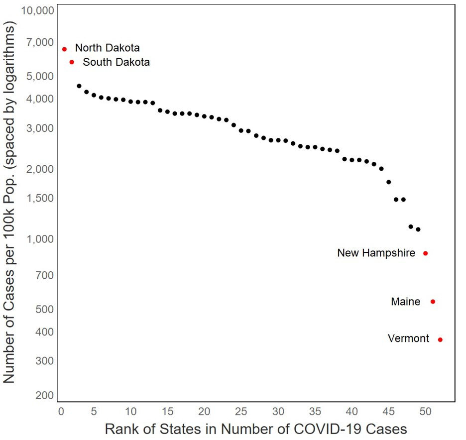
Figure 2: Covid cases per 100,000 residents by state (plus DC and Puerto Rico). (Data on 6 November 2020 from CNN.)
The two states in Figure 2 with large outbreaks are North and South Dakota, which had resisted public health restrictions and were dealing with the aftermath of a superspreader motorcycle rally. The three other states that break from the overall pattern appeared, at the time, to be holding down the spread of the virus. They are (in order from the bottom) Vermont, Maine, and New Hampshire – adjacent New England states that have had strong restrictions on public gatherings and requirements for mask wearing.
But is it statistics?
The practice of evidence-driven scientific investigations developed by Fisher, Pearson, Neyman and others during the first half of the twentieth century changed the world, and their view of how to do empirical research held sway until 1962 when John Tukey published his prophetic “The future of data analysis”.3 This paper provided the justification for using a different outlook and a different set of tools for understanding the world. Tukey provided the beginning of an epistemological justification for the atheoretical plotting of data in the search for suggestive patterns. His term for such activities is exploratory data analysis, often abbreviated EDA in the data science literature.4
The search for patterns can yield two important results of interest:
- the pattern itself, which often provides insight into deep underlying structures exemplified by the data, and
- deviations from that pattern, which often signal an aspect of the data that deserves special attention.
So, the question we should address is whether the Zipf-informed displays of Figures 1 and 2 are anecdotes or evidence of a regularity that we can harness for insight. Is the linearity in Zipf plots real or an artifact? In fact, the relationship noted by Zipf holds so often that it is disquieting. Let us offer a few disparate illustrations (taken from Wainer (2000)5).
In 1898 Bortkewitsch reported that in the 20 years between 1875 and 1894 there were 196 deaths among the 14 corps in the Prussian Army due to horse kicks.6 If we sort the years by the number of deaths and plot their log as a function of the order, we find that Zipf’s law holds (Figure 3).
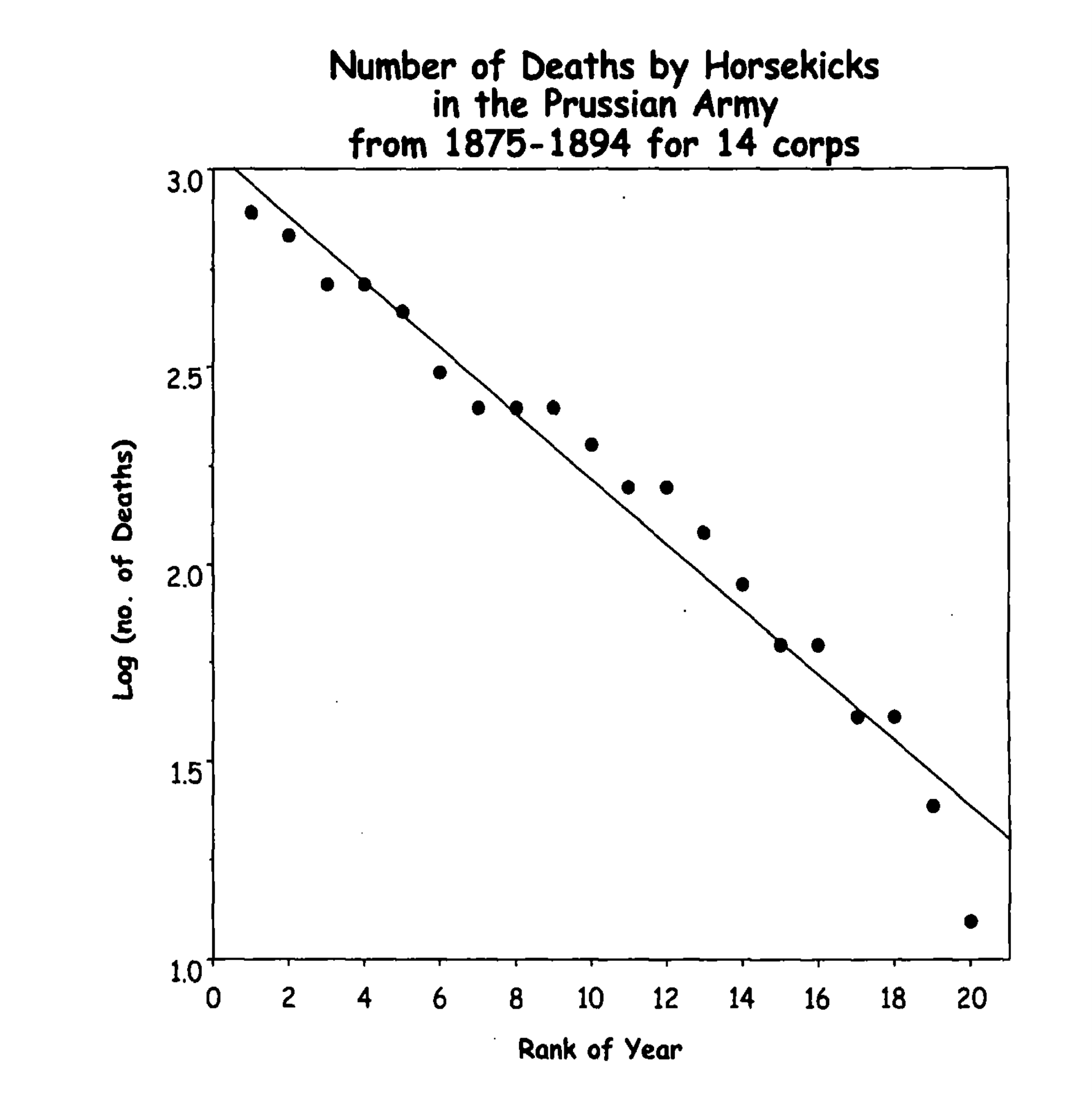
Figure 3: Classic data from Bortkewitsch (1898) that are usually used to illustrate the Poisson distribution.
Zipf’s law also holds when an underlying continuous variable is cut into categories. For example, incomes are often only available in categories. Figure 4 displays family income of SAT-takers.
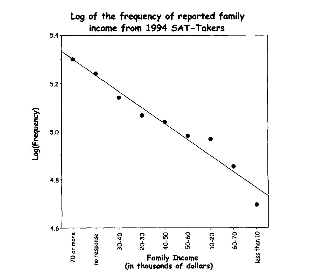
Figure 4: Categories of reporting family income are log linear.
Zipf’s law even holds when the sample sizes are modest. During the course of a committee meeting in which the 10 committee members contributed differentially, the log of the frequency of each person’s comments was linear in their ranks (Figure 5).
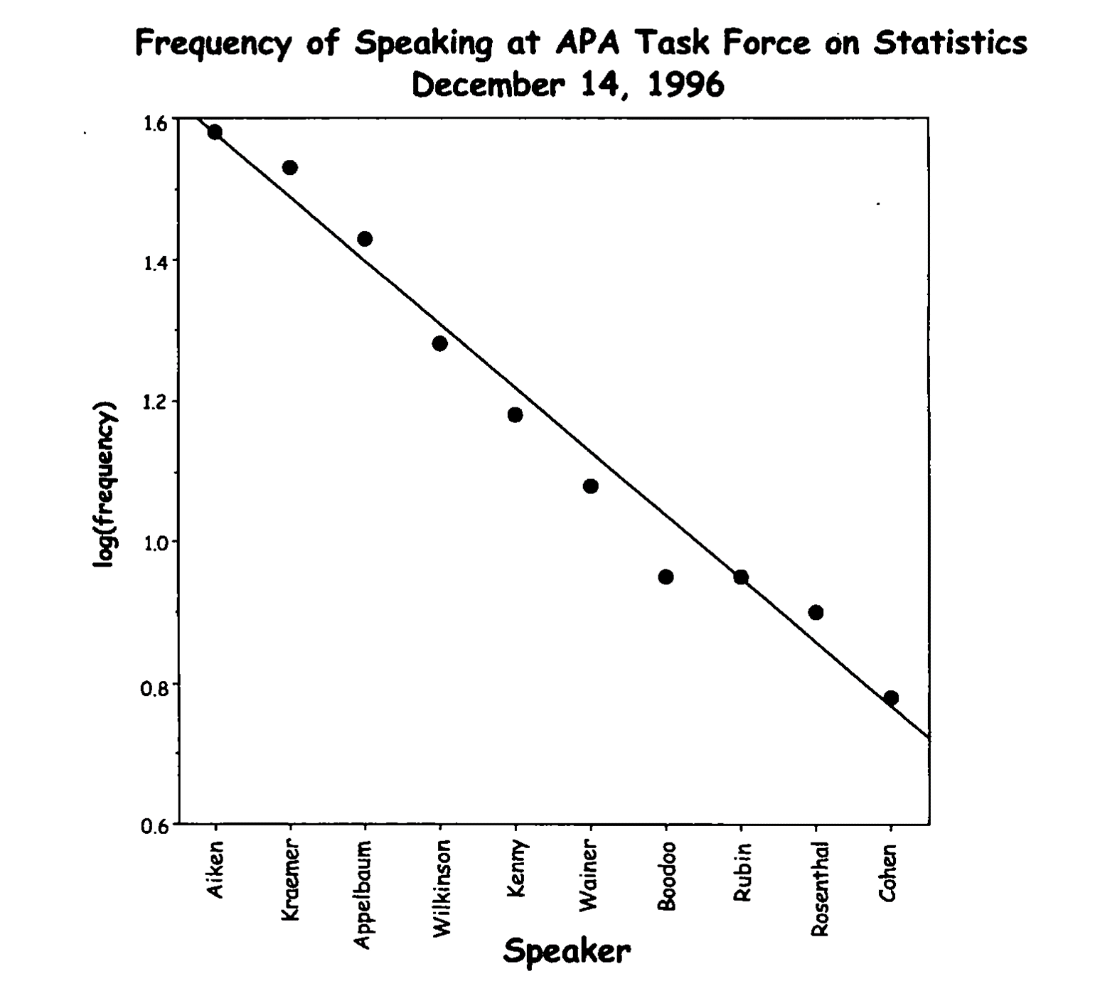
Figure 5: Frequency of speaking at a committee meeting shows how Zipf’s law even works in smallish samples.
As you can see, the regularity with which the log of the frequency is linear in its rank is surprisingly broad. And, as noted earlier, one of the most useful applications of Zipf’s law is to provide a background standard against which we can identify outliers or subsets of cases that differ from the main body of data. Figure 6 shows one more example from the recent US election.
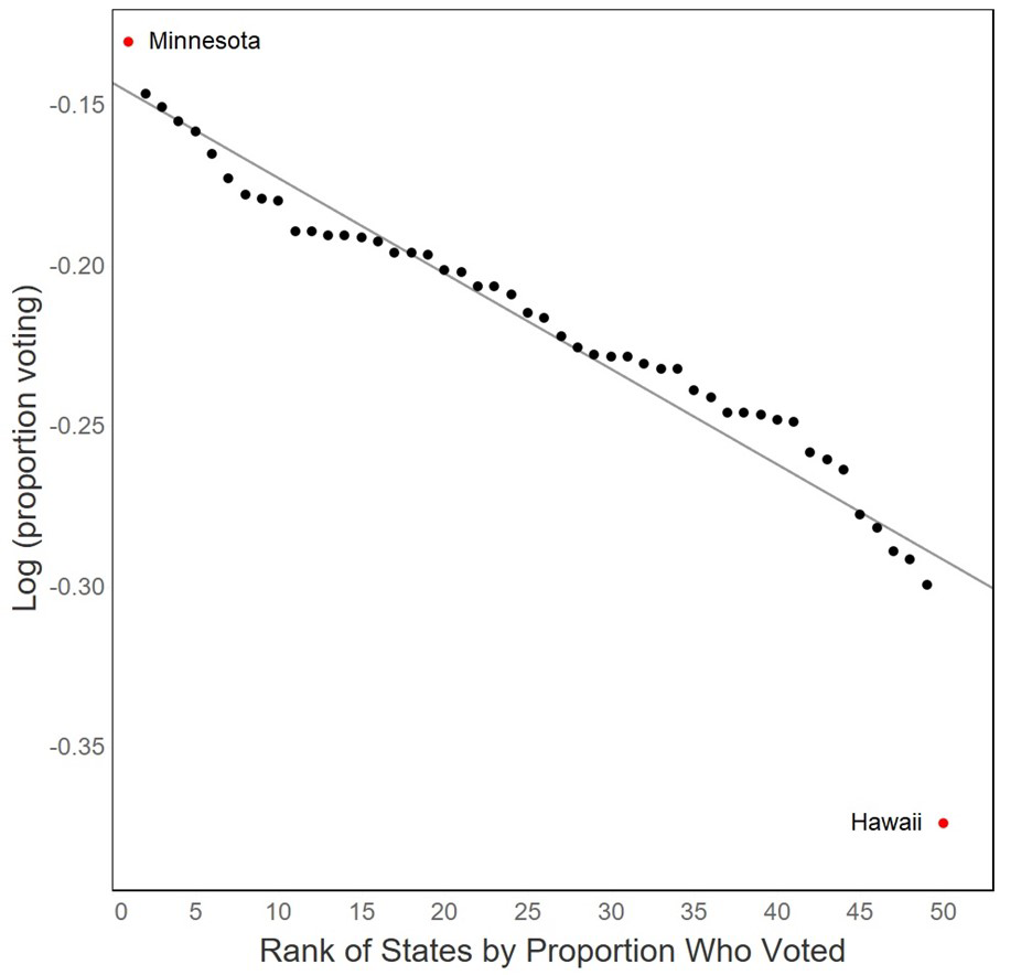
Figure 6: The fraction of eligible voters who voted in the 2020 US Presidential election. The high value is for Minnesota; the low one for Hawaii.
Conclusions and discussions
This short article is as much about epistemology as it is epidemiology. The epidemiological questions fall into two related categories: what’s usual, and what’s unusual? The second question is critical for us to try to uncover what policies are harmful by studying those entities that are exhibiting unusually high Covid infection rates and contrasting them with the policies that are associated with entities that have especially low rates of Covid infections. Obviously, we can’t tell what is unusual without first establishing what’s usual.
EDA is founded on the belief that the world is “lawlike”. That is, there are patterns and consistencies that repay the effort to notice and describe them, and we should be open to discovering them in our data without preconceived assumptions. Of course, that belief underlies the physical, biological and social sciences. Scientists have often first noticed regularities and patterns (and anomalies) and then sought explanations. Indeed, if you do not believe (without proof) that the world is essentially lawlike, you might not want to practice statistics; you’d be wasting your time describing, modeling, summarizing, and testing regularities that you didn’t believe were real in the first place.
What we offer here is another widely-observable regularity that is easy to display and can be useful as a summary – especially for nominating outliers and identifying subgroups. It isn’t theoretically deep; but if the Zipf pattern does describe most – but not all – of your data, then you probably should look carefully at the cases that don’t fit or the places where the linear pattern breaks. The method seems especially valuable for determining whether extreme values are “too extreme”.
In the early part of the last century the poet Edna St. Vincent Millay wrote:
Upon this gifted age, in its dark hour,
Rains from the sky a meteoric shower
Of facts . . . they lie unquestioned, uncombined
Wisdom enough to leech us of our ill
Is daily spun, but there exists no loom
To weave it into fabric.7
During the course of the Covid-19 pandemic we receive daily reports of the incidence of infections, recoveries, and deaths for countries of the world and subsections or states within countries. The accuracy of these reports is often unknown, but surely varies widely. To be able to understand this meteoric shower of facts we need a loom to weave it into a fabric for comparison.
In this article we have proposed using the regularities of Zipf’s law and suggested that we can focus our attention on deviations from those regularities. The outlier detection literature is large. Most methods attempt to estimate variability of the non-outlying points, fighting off the influence of the (not yet identified) outliers, and some require substantial computing. Zipf makes no such assumptions and has no such pretentions. We propose it as a simple graphical loom on which to weave the shower of facts about the pandemic. At a time when identifying extraordinary cases may help public health, simple, easily used methods may have value.
We encourage our readers to use Zipf’s law to examine data. It is often suggestive, and it is inexpensive and easy to apply. For a thorough, technical discussion of Zipf’s law within a broader context see the physicist Mark Newman’s 2005 exposition.8
About the authors
Debra M. Boka is a doctoral student in sociology at the University of California, Irvine. She holds a master’s degree in demographic and social analysis.
Paul Velleman is professor emeritus of statistics and data science at Cornell University.
Howard Wainer is a statistician and the author of Truth or Truthiness: Distinguishing Fact from Fiction by Learning to Think like a Data Scientist, published 2016.
This work is collaborative in all respects; thus, the order of authorship is alphabetical.
References
- Auerbach F. (1913) Das Gesetz der Bevölkerungskonzentration. Petermann’s Geographische Mitteilungen, 59, 74–76.
- Stigler, S. (1980) Stigler’s law of eponymy. In a Festschrift for Robert Merton (F. Gieryn, ed.). Transactions of the New York Academy of Sciences, 39: 147–58, doi: 10.1111/j.2164 947.1980.tb02775.x.
- Tukey, J. W. (1962) The future of data analysis. Annals of Mathematical Statistics, 33, 1-67 and 812. Available online at https://projecteuclid.org/euclid.aoms/1177704711
- Tukey J. W. (1977) Exploratory data analysis. Chapter 18, Reading, MA: Addison-Wesley.
- Wainer, H. (2000) Rescuing Computerized Testing by Breaking Zipf’s Law. Journal of Educational and Behavioral Statistics, 25, 203-224.
- Bortkewitsch, L. von (1898) Das Gesetz der kleinen Zahlen. Leipzig: Teubner.
- Millay, Edna St. Vincent (1939). Huntsman, What Quarry? New York: Harper Brothers.
- Newman, M. E. J. (2005). Power laws, Pareto distributions and Zipf’s law, Contemporary Physics, 46:5, 323-351, doi: 10.1080/00107510500052444.


