
In many parts of the world, the outcome of the Covid-19 outbreak has a lot to do with the choices people make about social distancing and obeying restrictions, as well as choices about their own personal care, such as maintaining a more thorough approach to handwashing or, more controversially, when it is appropriate to wear a mask. Those decisions will be influenced by each individual’s knowledge and beliefs, which – in turn – are shaped by the information they receive from government, from healthcare professionals, and from the media.
It is difficult to imagine how the stakes could be higher for anyone involved in science communication.
Most of the information presented to the public so far has come in the form of words and numbers – written or spoken. But the Covid-19 pandemic has empirical elements that are of a scale difficult to comprehend without appropriate and informative data visualisation.
Consider, for example, the appeal to “flatten the curve” – which has become a motto for doing one’s part to limit the rate of growth of the outbreak, so that the critical care capacity is not surpassed and as many people as possible can receive the treatment they need. As Tom Calver, senior data and interactive journalist at the Times and the Sunday Times, points out: “People have been saying ‘come on guys, flatten the curve,’ without even knowing that they’re referencing some kind of obscure visualisation”. He refers to an image that is a composite of work from several different teams: an early paper from Kelso et al. in 2009 used two charts to show the difference in peak number of cases under differing reproductive rates; this year Fong et al. used the two curves together to illustrate the reduction in peak number of daily cases where an intervention had been introduced; and then later Dalton et al. introduced a horizontal line to represent the critical care capacity on any given day (Figure 1).
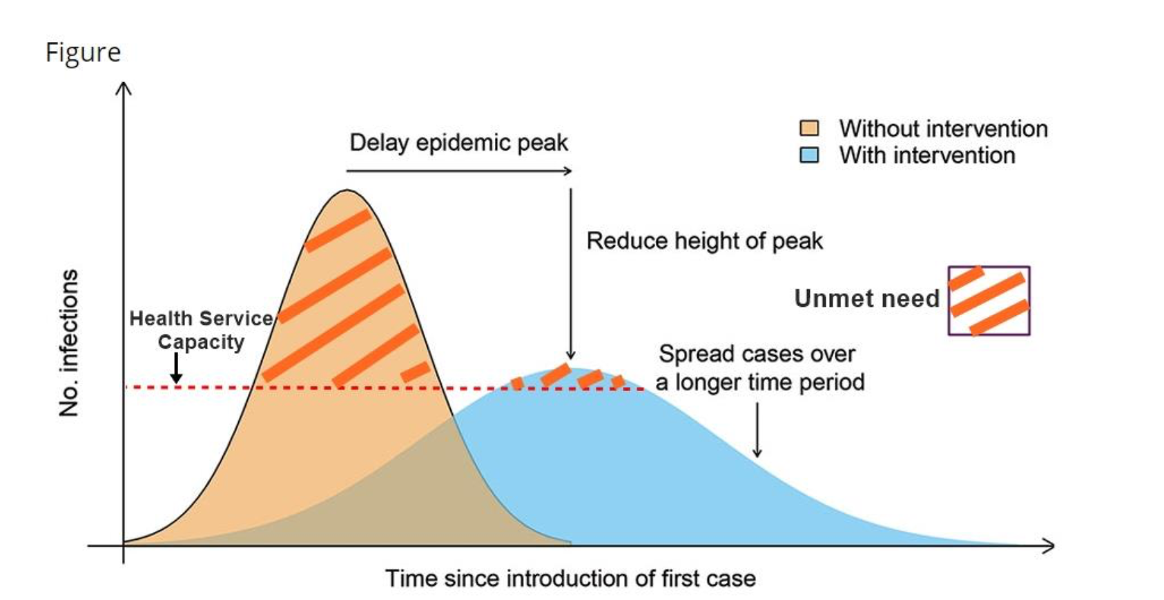
FIGURE 1 From “Pre-emptive low cost social distancing and enhanced hygiene implemented before local Covid-19 transmission could decrease the number and severity of cases”, by Dalton et al.
This image, popularised in an earlier form by the Economist among other sources, highlights the relative difference in the number of patients that healthcare systems would be able to treat if people made changes to their behaviour. While the area under each curve is the same, and represents the same number of patients, the flatter curve has a lower peak, allowing society to better manage the cases and provide treatment with limited resources.
While good at explaining the benefits of public action and restrictions, the image is relieved of the complication of including actual data from the pandemic. There is a trove of “flatten the curve” chart reproductions in different formats, including cartoons and animations, but the Washington Post has come closest to adding a numerical argument to the image by charting the outcomes of a simulated fictitious illness, “simulitus”, under different approaches to preventative measures, producing a visualisation that received widespread acclaim for its approach.
Cases and deaths
Following events on social media could lead you to believe that the Financial Times (FT) has made the greatest contribution to visualising the pandemic. The FT coronavirus tracker has become a lesson in maintaining a visual style in the new age of digital journalism, managing to be both ubiquitously iconic and, at the same time, continuously evolving and updating, responding to suggestions from readers and new data points. As the FT tracker has introduced new chart designs, the coverage of many other media outlets has followed suit. The tracker webpage is now the most viewed page of the FT site and has been reposted on social media by (amongst a multitude of others) Nobel prize winning economist Paul Krugman. As the chart’s creator, John Burn-Murdoch, recounts, it has gone from a plan scribbled out at his kitchen table to phone calls with 10 Downing Street over how to design charts for the seat of government in the UK.
The original FT tracking chart from 11 March plotted cumulative confirmed cases on a log-scale against the number of days since the 100th confirmed case. Its structure was very similar to a chart originally designed by Jeroen Kools, data scientist at Edge Analytics, and made popular through a Reddit post on r/DataIsBeautiful on 8 March. The notable exception is that Kools’s chart used a less conservative starting point, charting the cumulative cases against the number of days since the 40th confirmed case. Adjusting the starting point is needed for balance, to capture as much of the story as possible while still excluding early clusters of disease that arrive and disperse before a country’s main outbreak begins.
This form of chart was helpful at the onset of the outbreak, while many nations were considering what measures to implement in limiting the spread of the virus and few had yet to experience a large number of fatalities. It was useful to highlight and contrast the rate of growth in confirmed cases between nations with differing containment policies. The logarithmic scale on the y-axis of the FT chart sparked some criticism for not being immediately interpretable, but readers adjusted. As Tom Calver says: “The … visualisation vocabulary of the population has improved throughout the course [of the pandemic]. Maybe that’s a snobby thing to say, but I think people are getting used to these new types of charts.” The transformed axis allowed readers to easily see the rate of increase in various countries, and to infer (from the multiplication of cases) the efficacy of different national testing and crisis management schemes. To the public, the steepness of a curve became a rough measure of how well a government was managing their response.
As the outbreak developed, evidence suggested that testing regimes had an effect on the reported numbers of confirmed cases. As Calver points out, “if you look at the age breakdown of countries that have vigorous testing methods, so Iceland or South Korea for example, you see a very large number of infected people under the age of 50, but if you compare that to countries like [the] Netherlands, and Britain (although we don’t have very good data on ages), and also Italy, you see that the case numbers skew towards the elderly, because basically they are only testing people who are very clearly ill and need to get treatment for it, and completely missing the vast majority of young people that have the virus”. It was difficult to tell if a country had a low number of cases or if it had restricted testing.
Faced with different national testing paradigms that defied comparisons of confirmed case numbers, the FT’s early response was to shift to plotting cumulative deaths against the number of days since the tenth death.
As of the time of writing this article, in mid-April, and with a large part of the world having lived through weeks of social distancing measures and restrictions on movement, there are some signs of the pandemic slowing down in several places. Charts that can clearly indicate a real drop in the daily numbers of new cases provide a light at the end of the tunnel for people confined to their homes and wondering when they will be able to return to some semblance of a normal routine.
With these sunnier horizons in mind, the FT tracker has again been restructured. It adopted a seven-day average of new deaths plotted against time, where the origin of the chart begins when the number of new daily deaths rises above three (Figure 2). When the epidemic reaches a peak in a given country, it will be far easier to see it from this chart than it would be from inspecting the bend in a curve at the high end of a log-scaled visualisation plotting cumulative deaths.
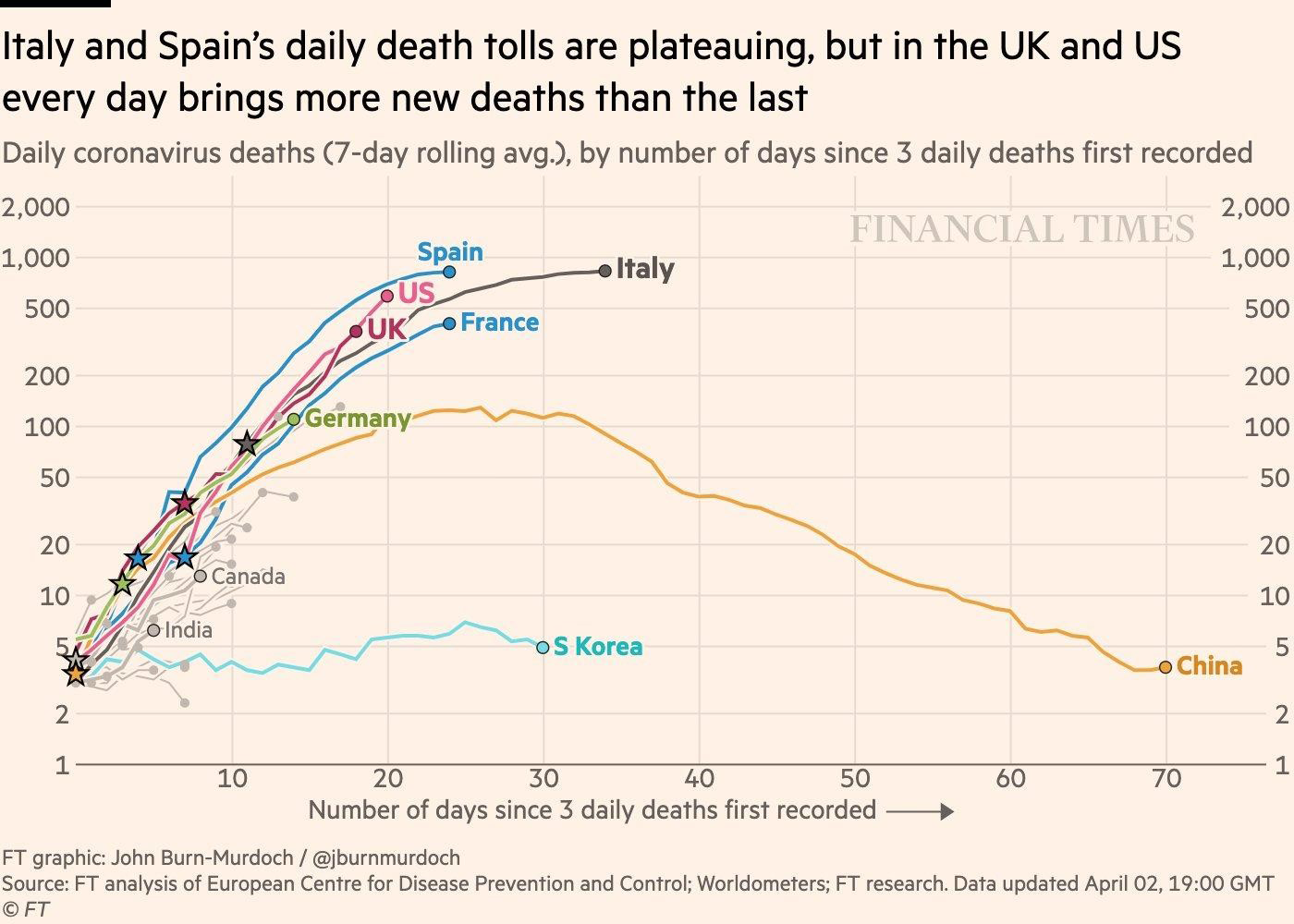
FIGURE 2 The Financial Times chart of daily coronavirus deaths (seven-day rolling average) by number of days since three daily deaths first recorded, as of 19:00 2 April 2020, by John Burn-Murdoch.
“This really has been a sort of organic, narrative, story-following process,” says John Burn-Murdoch, who is the senior interactive and data journalist at the FT. First on Twitter, and then through a dedicated inbox staffed by three people at the newspaper, Burn-Murdoch has opened up channels for the readership to contact the team with suggestions and comments. This feedback loop went as far as to offer readers alternative models for smoothing out the same noisy daily data, contrasting the status quo of a seven-day rolling average with a newly implemented spline function, which gave the curve more flexibility and allowed its shape to more faithfully reflect the most recent data points (the curve is, essentially, divided up into different pieces, and each piece is influenced by nearby data points).
Gathering data
Charting the spread of the novel coronavirus as it grew from the Chinese city of Wuhan into a global pandemic has been a challenge for the researchers and journalists communicating with the general public. The measurable information is constantly changing as new announcements are made of confirmed cases and fatalities, requiring automated processes and access to a production line of sources focussed on this single issue. But it is not a simple task to find contemporary and accurate data on which to act.
At the Times and Sunday Times, Tom Calver says that they use the Johns Hopkins University (JHU) data for international reportage, but that, being a UK-based newspaper, they make special efforts with the UK figures, verifying them with NHS England data, the Public Health Dashboard, and several other repositories. “When you look at the JHU data, for example for the UK, you see [that] the data ‘staircases’ a lot, a sharp rise and then a day of nothing, and then a sharp rise and then a day of nothing,” says Calver. “In no pandemic are you going to get this kind of flat line and then increase, and then a flat line and an increase, in the space of a few days. Our battle is as much with revealing what data we don’t know and trying to iron that out where possible.”
Referring to the data given in the UK by the Department of Health and Social Care (DHSC), and specifically of the increase in the number of deaths announced on any given day, Burn-Murdoch says: “Let’s say – very, very approximately speaking – maybe 50% of the people [that are newly included in a data release] would have died on that day, 30% are from the day before, 15% the day before that, and 5% died over a scattering of days before then.” Burn-Murdoch attributes the delay in reporting to factors that can include difficulties in contacting next-of-kin before announcing a death. In contrast to the UK government figures, NHS England report daily figures that give a date-of-death in each announcement but are still subject to a reporting lag. “The apportioning of deaths to days is correct,” says Burn-Murdoch, “but the trajectory of the curve [of cumulative deaths] always looks flatter for the last two or three days than it is in reality.”
For someone following events over successive days, it can feel as though the country’s death toll is perpetually on the verge of peaking, while the prior few days always appear to be getting revised upwards. Cautious viewers of the data will be aware that there can be no certainty that the pandemic has reached its peak in a country until after it has passed, but it takes an informed view on data reporting protocol to understand that early signs of the pandemic slowing down are often drawn from an understatement of the facts, and are likely to be premature.
“One of the other issues with the UK [DHSC] and NHS England numbers,” says Burn-Murdoch, “is they only record deaths that occurred in hospitals, whereas, of course, there are plenty of deaths at home or in nursing homes as well, some of them testing positive for coronavirus.”
Tracking the spread
Newspaper investigations into the spread of coronavirus have had some unexpected consequences. Researchers at Columbia University noticed that the New York Times (NYT) tracing of coronavirus activity in the US contained information at the county level that no one else was able to access. Describing the paper’s approach to gathering data, James Glanz, an international and investigative journalist at the NYT, says: “You’ve got to make some phone calls, you’ve got to scrape some data, and check figures against one another and that’s the only way to do this kind of messy, national-scale sort of operation.”
Following a meeting between Jeffrey Shaman of Columbia University and Glanz, the paper ran a front-page story based on NYT data and a model from Columbia. The following day, the newspaper devoted the first five pages to their “How the Virus Got Out” visualisation (Figure 3). Around this time, the team behind the visualisation began to get calls from various different research organizations, including JHU, recalls Glanz. The newspaper then decided to provide coronavirus tracking information to academic institutions and the public, and published a GitHub repository to make this freely available to all.
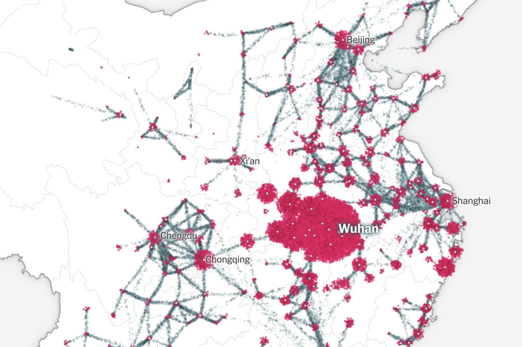
FIGURE 3 “How the Virus Got Out”, by Jin Wu, Weiyi Cai, Derek Watkins and James Glanz of the NYT, 22 March 2020.
The widespread popularity of this NYT article, showing the geographic origins of the coronavirus and its quick spread in the weeks running up to Chinese New Year, may be due to its singular contribution to the understanding of events. Some attention is given to the number of cases, built on models in literature for the likely spread of the virus, but the backbone of the piece is from a record of people’s movements, from mobile phone data describing motion of transit within China, and records of flight destinations out of Wuhan. A powerful contrast is made between movement before and after restrictions were in place, coupled with a profoundly troubling image of the clusters of cases across the map multiplying exponentially. David Blood, data reporter for the FT, says: “You see the outbreak bloom like a flower across China. Nowhere else can you see that. In my experience, the primary obstacles to that kind of visual journalism — as so often — lie in the availability of and access to data. The former can be out of our control as journalists; the latter, it’s incumbent upon us to cultivate.”
About the author
Dr Andrew Garthwaite is a freelance data journalist, statistician, illustrator and cartoonist.


